The “Ames houring” dataset, part of a Kaggle competition, is an extended and more modern version of the Boston housing datasets. It presents 81 features of houses – mostly single family suburban dwellings – that were sold in Ames, Iowa in the period 2006-2010, which encompasses the housing crisis. Compared to the Boston dataset, it is more complex to handle, with missing data and both categorical and numerical features.
The goal is to build a machine learning model to predict the selling price for the home, and in the process learn something about what makes a home worth more or less to buyers. Since the housing market isn’t particularly hard to understand, the most important features are not difficult to guess: overall size, number of room, quality of the house, neighborhood, the overall economy, and we should be able to see this in the data using a simple regression model, which we do in this first part. In this second part of this port we’ll explore more sophisticated models.
from datetime import datetime
import matplotlib.pyplot as plt
import matplotlib.ticker as tkr
import numpy as np
import pandas as pd
import seaborn as sns
df = pd.read_csv('./ames-dataset-orig.csv', sep='\t')
df.drop(['Order', 'PID'], axis=1, inplace=True)
df = df.replace(['NA', ''], np.NaN)
print(f"The dataset contains {len(df)} rows and {len(df.keys())} columns")
print(f"The dataset contains {df.isna().sum().sum()} NAs.")
The dataset contains 2930 rows and 80 columns
The dataset contains 13997 NAs.
numeric = [k for k in df.keys() if k not in df.select_dtypes("object").keys()]
df[numeric] = df[numeric].astype('float')
It is easier to work with column names without spaces, so we remove them.
df.columns = df.columns.str.replace(' ', '')
A quick look at the first lines shows all the columns.
df.head()
| MSSubClass | MSZoning | LotFrontage | LotArea | Street | Alley | LotShape | LandContour | Utilities | LotConfig | ... | PoolArea | PoolQC | Fence | MiscFeature | MiscVal | MoSold | YrSold | SaleType | SaleCondition | SalePrice | |
|---|---|---|---|---|---|---|---|---|---|---|---|---|---|---|---|---|---|---|---|---|---|
| 0 | 20.0 | RL | 141.0 | 31770.0 | Pave | NaN | IR1 | Lvl | AllPub | Corner | ... | 0.0 | NaN | NaN | NaN | 0.0 | 5.0 | 2010.0 | WD | Normal | 215000.0 |
| 1 | 20.0 | RH | 80.0 | 11622.0 | Pave | NaN | Reg | Lvl | AllPub | Inside | ... | 0.0 | NaN | MnPrv | NaN | 0.0 | 6.0 | 2010.0 | WD | Normal | 105000.0 |
| 2 | 20.0 | RL | 81.0 | 14267.0 | Pave | NaN | IR1 | Lvl | AllPub | Corner | ... | 0.0 | NaN | NaN | Gar2 | 12500.0 | 6.0 | 2010.0 | WD | Normal | 172000.0 |
| 3 | 20.0 | RL | 93.0 | 11160.0 | Pave | NaN | Reg | Lvl | AllPub | Corner | ... | 0.0 | NaN | NaN | NaN | 0.0 | 4.0 | 2010.0 | WD | Normal | 244000.0 |
| 4 | 60.0 | RL | 74.0 | 13830.0 | Pave | NaN | IR1 | Lvl | AllPub | Inside | ... | 0.0 | NaN | MnPrv | NaN | 0.0 | 3.0 | 2010.0 | WD | Normal | 189900.0 |
5 rows × 80 columns
It is absolutely important to understand what the columns represent. The best description of the dataset is in the description provided by the dataset’s author, which is worth a read. Let’s check the number of non-null elements in each columns.
df.info()
<class 'pandas.core.frame.DataFrame'>
RangeIndex: 2930 entries, 0 to 2929
Data columns (total 80 columns):
 #   Column         Non-Null Count  Dtype
---  ------         --------------  -----
 0   MSSubClass     2930 non-null   float64
 1   MSZoning       2930 non-null   object
 2   LotFrontage    2440 non-null   float64
 3   LotArea        2930 non-null   float64
 4   Street         2930 non-null   object
 5   Alley          198 non-null    object
 6   LotShape       2930 non-null   object
 7   LandContour    2930 non-null   object
 8   Utilities      2930 non-null   object
 9   LotConfig      2930 non-null   object
 10  LandSlope      2930 non-null   object
 11  Neighborhood   2930 non-null   object
 12  Condition1     2930 non-null   object
 13  Condition2     2930 non-null   object
 14  BldgType       2930 non-null   object
 15  HouseStyle     2930 non-null   object
 16  OverallQual    2930 non-null   float64
 17  OverallCond    2930 non-null   float64
 18  YearBuilt      2930 non-null   float64
 19  YearRemod/Add  2930 non-null   float64
 20  RoofStyle      2930 non-null   object
 21  RoofMatl       2930 non-null   object
 22  Exterior1st    2930 non-null   object
 23  Exterior2nd    2930 non-null   object
 24  MasVnrType     2907 non-null   object
 25  MasVnrArea     2907 non-null   float64
 26  ExterQual      2930 non-null   object
 27  ExterCond      2930 non-null   object
 28  Foundation     2930 non-null   object
 29  BsmtQual       2850 non-null   object
 30  BsmtCond       2850 non-null   object
 31  BsmtExposure   2847 non-null   object
 32  BsmtFinType1   2850 non-null   object
 33  BsmtFinSF1     2929 non-null   float64
 34  BsmtFinType2   2849 non-null   object
 35  BsmtFinSF2     2929 non-null   float64
 36  BsmtUnfSF      2929 non-null   float64
 37  TotalBsmtSF    2929 non-null   float64
 38  Heating        2930 non-null   object
 39  HeatingQC      2930 non-null   object
 40  CentralAir     2930 non-null   object
 41  Electrical     2929 non-null   object
 42  1stFlrSF       2930 non-null   float64
 43  2ndFlrSF       2930 non-null   float64
 44  LowQualFinSF   2930 non-null   float64
 45  GrLivArea      2930 non-null   float64
 46  BsmtFullBath   2928 non-null   float64
 47  BsmtHalfBath   2928 non-null   float64
 48  FullBath       2930 non-null   float64
 49  HalfBath       2930 non-null   float64
 50  BedroomAbvGr   2930 non-null   float64
 51  KitchenAbvGr   2930 non-null   float64
 52  KitchenQual    2930 non-null   object
 53  TotRmsAbvGrd   2930 non-null   float64
 54  Functional     2930 non-null   object
 55  Fireplaces     2930 non-null   float64
 56  FireplaceQu    1508 non-null   object
 57  GarageType     2773 non-null   object
 58  GarageYrBlt    2771 non-null   float64
 59  GarageFinish   2771 non-null   object
 60  GarageCars     2929 non-null   float64
 61  GarageArea     2929 non-null   float64
 62  GarageQual     2771 non-null   object
 63  GarageCond     2771 non-null   object
 64  PavedDrive     2930 non-null   object
 65  WoodDeckSF     2930 non-null   float64
 66  OpenPorchSF    2930 non-null   float64
 67  EnclosedPorch  2930 non-null   float64
 68  3SsnPorch      2930 non-null   float64
 69  ScreenPorch    2930 non-null   float64
 70  PoolArea       2930 non-null   float64
 71  PoolQC         13 non-null     object
 72  Fence          572 non-null    object
 73  MiscFeature    106 non-null    object
 74  MiscVal        2930 non-null   float64
 75  MoSold         2930 non-null   float64
 76  YrSold         2930 non-null   float64
 77  SaleType       2930 non-null   object
 78  SaleCondition  2930 non-null   object
 79  SalePrice      2930 non-null   float64
dtypes: float64(37), object(43)
memory usage: 1.8+ MB
By inspecting the output of describe(), we see that three columns have less than 300 non-null entries. Such columns have little explanatory power, so it is better to remove them.
df.drop(['Alley', 'PoolQC', 'MiscFeature'], axis=1, inplace=True)
print(f"Kept {len(df.keys())} columns.")
Kept 77 columns.
We have quite a lot of missing data, with Alley, FireplaceQu, PoolQC, Fence, MiscFeature almost empty, and a few others, like LotFrontage for example, that have a handful of null values. Later on we’ll see how to deal with such cases. We also need to remove all data with MSZoning defined as commercial, agriculture and industrial as these are not residential units.
condition = (df.MSZoning != 'C (all)') & (df.MSZoning != 'I (all)') & (df.MSZoning != 'A (agr)')
df = df[condition]
df['MSZoning'].value_counts()
RL    2273
RM     462
FV     139
RH      27
Name: MSZoning, dtype: int64
And now let’s look at the features in more details. The last column is SalePrice, which is the target we would like to predict, and is numerical. For the remaining columns, we have both numerical and categorical features, roughly in the same proportion. For the time being we keep both features and target in the same dataset, as we want to find to which features the target is correlated. We still take out the SalePrice column when we define the numerical features.
target_name = "SalePrice"
numerical_features = df.drop(columns=target_name).select_dtypes("number")
numerical_features = numerical_features[numerical_features.keys()]
print(f"# numerical features: {len(numerical_features.keys())}")
string_features = df.select_dtypes(object)
print(f"# categorical features: {len(string_features.keys())}")
# numerical features: 36
# categorical features: 40
Let’s start plotting from the categorical features.
from math import ceil
from itertools import zip_longest

n_string_features = string_features.shape[1]
nrows, ncols = ceil(n_string_features / 4), 4

fig, axs = plt.subplots(ncols=ncols, nrows=nrows, figsize=(14, 80))

for feature_name, ax in zip_longest(string_features, axs.ravel()):
    if feature_name is None:
        # do not show the axis
        ax.axis("off")
        continue

    string_features[feature_name].value_counts().plot.barh(ax=ax)
    ax.set_title(feature_name)

plt.subplots_adjust(hspace=0.2, wspace=0.8)
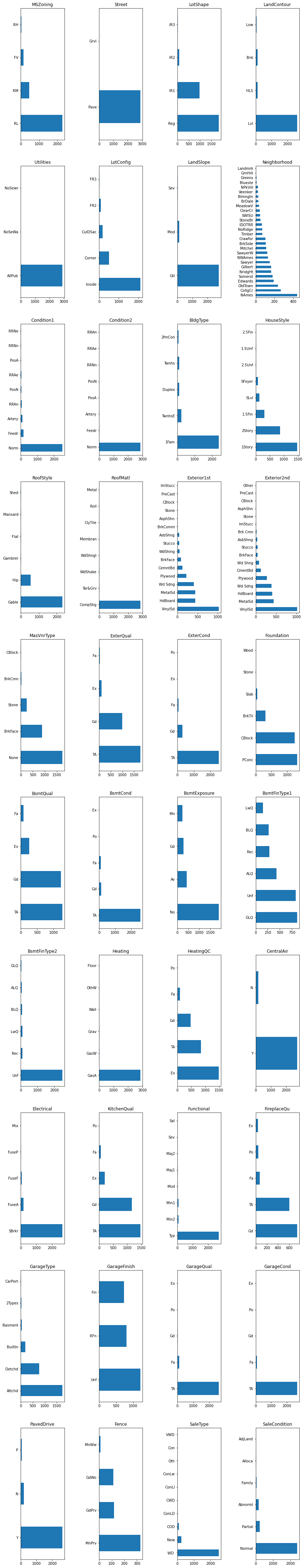
For quite a few features (for example, Electrical, Heating', 'Condition1', 'Condition2', GarageQual', 'GarageCond, Pavedrive) one category contains almost all the data, so the information they provide is small and we will ignore them.
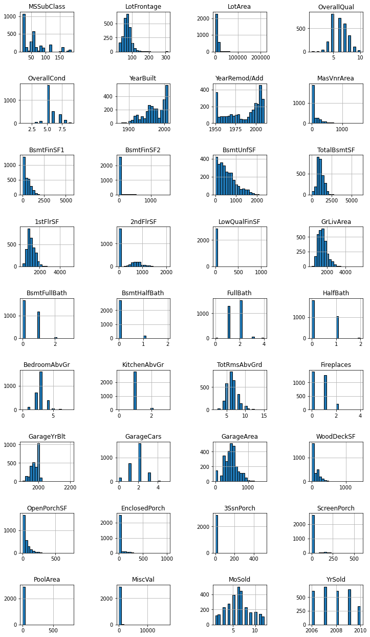
And now the numerical features by plotting their histograms.
numerical_features.hist(bins=20, figsize=(12, 22), edgecolor="black", layout=(9, 4))
plt.subplots_adjust(hspace=0.8, wspace=0.8)
Now we look at the correlation among numerical features.
corr = numerical_features.corr()
fig = plt.figure(figsize=(30, 30))
sns.heatmap(corr, cmap="coolwarm", vmin=-1, vmax=1, annot=True);
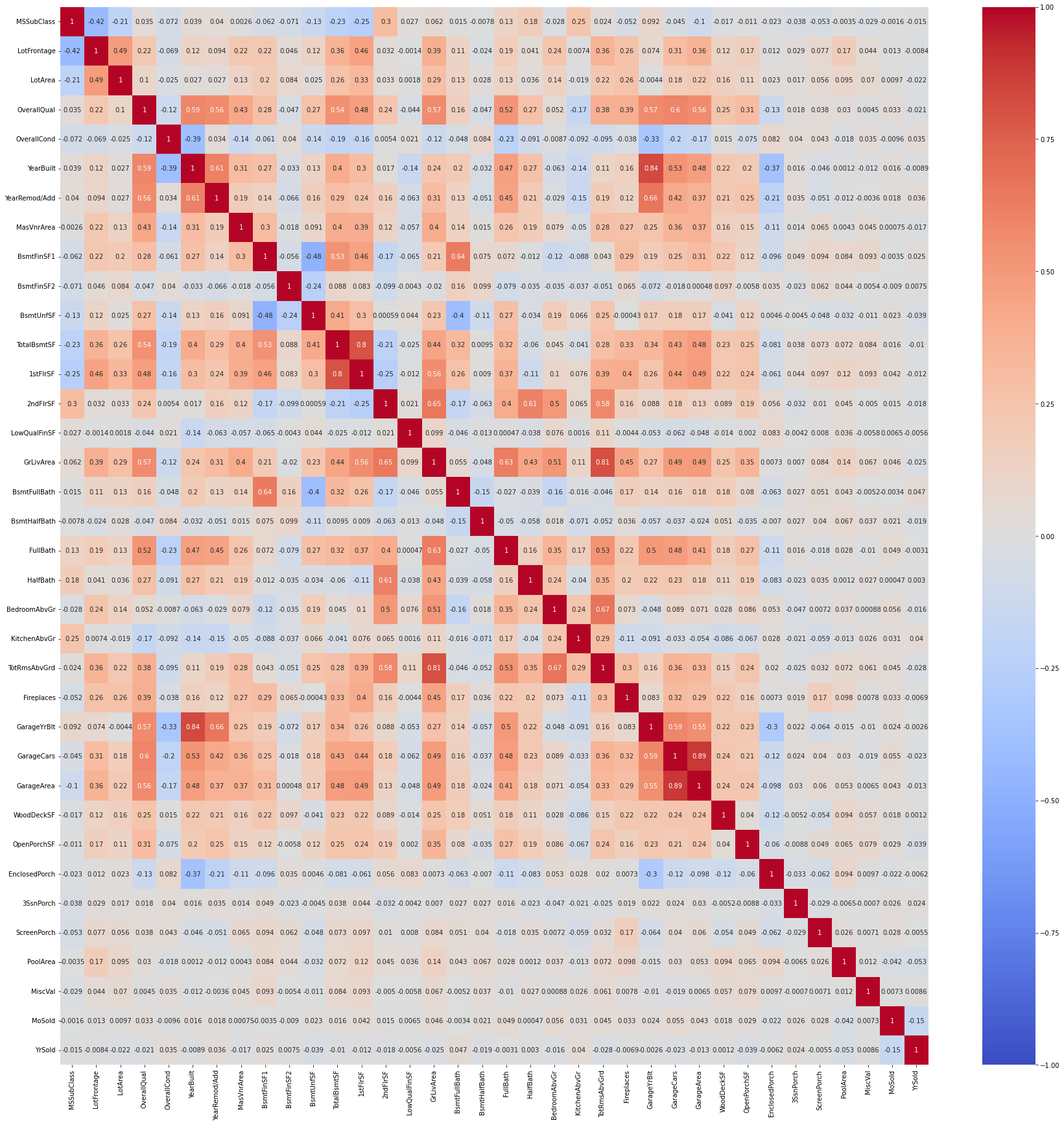
The heatmap contains lots of numbers and it is not easy to distinguish the wheat from the chaff. A simple loop over the correlation matrix reports the most important correlations.
for label, row in corr.iterrows():
    row = row[row.abs() > 0.6].dropna()
    if len(row) <= 1: continue
    print(label, end=':')
    for k, v in row.iteritems():
        if k == label: continue
        print(f' {k} ({v:.2%})', end='')
    print()
YearBuilt: YearRemod/Add (60.95%) GarageYrBlt (83.54%)
YearRemod/Add: YearBuilt (60.95%) GarageYrBlt (65.63%)
BsmtFinSF1: BsmtFullBath (63.94%)
TotalBsmtSF: 1stFlrSF (80.23%)
1stFlrSF: TotalBsmtSF (80.23%)
2ndFlrSF: GrLivArea (65.48%) HalfBath (61.36%)
GrLivArea: 2ndFlrSF (65.48%) FullBath (62.78%) TotRmsAbvGrd (80.70%)
BsmtFullBath: BsmtFinSF1 (63.94%)
FullBath: GrLivArea (62.78%)
HalfBath: 2ndFlrSF (61.36%)
BedroomAbvGr: TotRmsAbvGrd (67.11%)
TotRmsAbvGrd: GrLivArea (80.70%) BedroomAbvGr (67.11%)
GarageYrBlt: YearBuilt (83.54%) YearRemod/Add (65.63%)
GarageCars: GarageArea (88.82%)
GarageArea: GarageCars (88.82%)
The number of cars in the garage, as well as the size of the garage, are heavily correlated with the overall quality of the house. The built or renovation year for the house in unsurprisingly correlated with the renovation of built year for the garage. The area of the different sizes of the house are correlated as expected as well, as it is unusual to find a very large bathroom in a small house, or viceversa. The area of the first floor is heavily correlated with that of the basement, which makes sense from a typical construction.
It is time to look at a plot of the target distribution.
sns.histplot(df, x="SalePrice", bins=20, kde=True)
plt.xlabel("House price in $")
plt.axvline(x=df['SalePrice'].mean(), linewidth=4, color='red')
plt.axvline(x=df['SalePrice'].median(), linewidth=4, color='green')
_ = plt.title("Distribution of the house price in Ames")
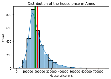
Clearly, house prices are only positive, with a long tail that stretched four times the mean value. Only a few houses have large prices though.
print(f"# prices < 500K: {sum(df['SalePrice'] <= 500_000)}, # prices above 500K: {sum(df['SalePrice'] > 500_000)}")
# prices < 500K: 2884, # prices above 500K: 17
The logarithm of the sale price is quite close to a normal distribution, meaning that the sale price itself is lognormal. The Q-Q plot shows some outliers, especially for low prices, but it otherwise quite close to that of a standard normal. This means that linear regression models should work nicely.
from scipy.stats import norm
import statsmodels.api as sm
df['LogSalePrice'] = np.log(df['SalePrice'])
df['ScaledLogSalePrice'] = \
    (df['LogSalePrice'] - df['LogSalePrice'].mean()) / df['LogSalePrice'].std()
mu, std = norm.fit(df['ScaledLogSalePrice'])

fig, (ax0, ax1) = plt.subplots(figsize=(12, 4), ncols=2)
sns.histplot(df, x="LogSalePrice", bins=20, kde=True, ax=ax0)
ax0.set_xlabel("Log House price in $")
ax0.axvline(x=df['LogSalePrice'].mean(), linewidth=4, color='red')
ax0.axvline(x=df['LogSalePrice'].median(), linewidth=4, color='green')
ax0.set_title('Log Sale Price')

_ = sm.qqplot(df['ScaledLogSalePrice'], line='r', ax=ax1)
ax1.set_title(f"Fitted normal: mu={mu:.4f}, std={std:.4f}");
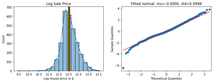
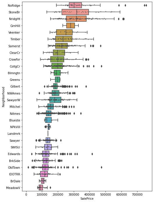
The point at -6 standard deviations is an outliner, with and Abnormal SaleCondition. Most of entries with ScaledLogSalePrice are in the same neighborhood, OldTown, with another few in Edwards and IDOTTR. As the boxplot below shows, OldTown has wide variations in the sale price, with a lowest value of about $12,000 and the highest of $450,000. Incidentally, this shows that the neighborhood feature is an important one. After all, one of the mantras of real estate is “location, location, location”, therefore we expect the neighborhood to be important. It is not clear how to use this variable though, as there are 28 different neighborhoods in the dataset and no obvious way to create a numerical variable out of them.
order = df.groupby('Neighborhood')['SalePrice'].mean().sort_values(ascending=False).index
fig = plt.figure(figsize=(8, 12))
sns.boxplot(data=df, x='SalePrice', y='Neighborhood', order=order)
sns.stripplot(data=df, x='SalePrice', y='Neighborhood', order=order,
              size=2, color=".3", linewidth=0)
<AxesSubplot:xlabel='SalePrice', ylabel='Neighborhood'>
A valuable alternative for the target is the price per square foot, which is often requested when looking for new houses. We plot it and compare with the sale price itself.
df['TotalLivArea'] = df['GrLivArea'] + df['1stFlrSF'] + df['2ndFlrSF']
df['SalePriceSF'] = df['SalePrice'] / df['TotalLivArea']

df['LogSalePriceSF'] = np.log(df['SalePriceSF'])
df['ScaledLogSalePriceSF'] = \
    (df['LogSalePriceSF'] - df['LogSalePriceSF'].mean()) / df['LogSalePriceSF'].std()
mu, std = norm.fit(df['ScaledLogSalePriceSF'])

fig, (ax0, ax1) = plt.subplots(figsize=(12, 4), ncols=2)
sns.histplot(df, x="LogSalePriceSF", bins=20, kde=True, ax=ax0)
ax0.set_xlabel("Log House price in $ per SF")
ax0.set_title('Log Sale Price per Square Foot')

_ = sm.qqplot(df['ScaledLogSalePriceSF'], line='r', ax=ax1)
ax1.set_title(f"Fitted normal: mu={mu:.4f}, std={std:.4f}");
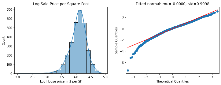
The difference isn’t massive, but SalePrice looks a tad better, so we’ll stick with that.
And now the difficult part – trying to find important relationships between the features and the target. By common sense we expect the sale price to be correlated with the year in which the house was built or last renovated; correlated with the lot area; correlated with the total house area; correlated with the number of rooms. We expect some dependency on the time of the transaction, with an effect from the 2008 crisis. Let’s explore each point.
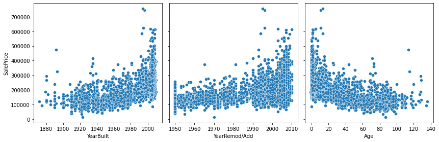
The age of the house, defined above as the number of years from when the house was built or last renovated. The Age feature we built above puts together YearBuilt and YearRemod/Add and shows what we expect: more modern houses are worth more than old houses. We will drop YearBuilt and YearRemod/Add and only use Age.
age = df.apply(lambda x: x['YrSold'] - x['YearBuilt'] \
        if x['YearBuilt'] < x['YearRemod/Add']
        else x['YrSold'] - x['YearRemod/Add'], axis=1)
age.name = 'Age'
df['Age'] = age
fig, (ax0, ax1, ax2) = plt.subplots(figsize=(12, 4), ncols=3, sharey=True)
sns.scatterplot(data=df, x="YearBuilt", y="SalePrice", ax=ax0)
sns.scatterplot(data=df, x="YearRemod/Add", y="SalePrice", ax=ax1)
sns.scatterplot(data=df, x="Age", y="SalePrice", ax=ax2)
fig.tight_layout()
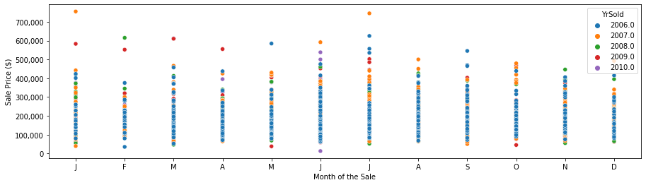
Plotting the sales price as a function of the month of the sale shows a little dependency, with large lages in January and July, surprising low prices in February, and slightly higher prices in March and April, followed by lower prices in December. The largest values are in 2007 (before the 2008 crisis), but we see large sale prices also for the period following the 2008 crisis.
fig, ax = plt.subplots(figsize=[15, 4])
sns.scatterplot(data=df, x='MoSold', y='SalePrice', hue='YrSold', palette='tab10')
plt.xticks([1, 2, 3, 4, 5, 6, 7, 8, 9, 10, 11, 12],
           ['J', 'F', 'M', 'A', 'M', 'J', 'J', 'A', 'S', 'O', 'N', 'D'])
plt.xlabel('Month of the Sale')
plt.ylabel('Sale Price ($)')
ax.get_yaxis().set_major_formatter(tkr.FuncFormatter(lambda x, p: f'{int(x):,d}'))
sale_dates = df[['YrSold', 'MoSold']].apply(
    lambda x: datetime(year=int(x['YrSold']), month=int(x['MoSold']), day=1), axis=1)
df['Sale Date'] = sale_dates
fig, ax = plt.subplots(figsize=[15, 4])
sns.scatterplot(data=df, x='Sale Date', y='SalePrice', hue='OverallQual', palette='tab10')
plt.xlabel('Sale Date')
plt.ylabel('Sale Price')
ax.get_yaxis().set_major_formatter(tkr.FuncFormatter(lambda x, p: format(int(x), ',')))
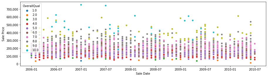
The highest sale prices (around 700,000) are recorded before the 2008 crisis; after 2008 the highest sale prices are much lower (between 500,000 and 600,000). So the 2008 crisis has a clear effect on the few transactions on the high side; for the majority of the sales it is less clear from the graph above. It is also obvious (and expected) that the overall quality of the house is quite important to determine the price.
Another feature that should play an important role in the sale price is the lot area. We first create ten bins and show the boxplots for each of them. The bins are defined using the 0%-quantile, 10%-quantile, and so on up to the 100%-quantile.
quantiles = df['LotArea'].quantile(np.linspace(0, 1, 11)).values
quantiles = list(map(int, quantiles))
df['LotArea Bin'] = pd.cut(df['LotArea'], quantiles)
fig, ax = plt.subplots(figsize=(10, 4))
sns.boxplot(data=df, x="LotArea Bin", y="SalePrice", ax=ax)
plt.xlabel('LotArea (Square feet)')
plt.ylabel('Sale Price ($)')
ax.set_xticklabels([f'[{quantiles[i]:,d}, {quantiles[i + 1]:,d})' for i in range(10)], rotation=90)
ax.get_yaxis().set_major_formatter(tkr.FuncFormatter(lambda x, p: format(int(x), ',')))
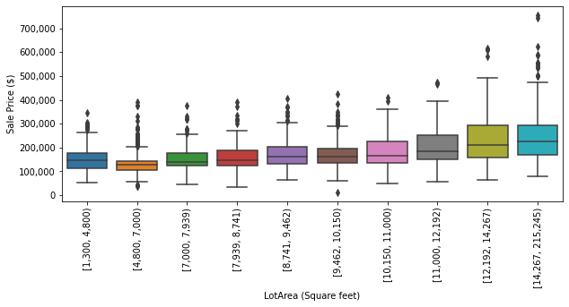
All the highest prices are in the 80%-to-100% quantiles and overall the mean price per quantile increases with the lot area; we can notice several outliers though. The mean of the second bin is smaller, and with less dispersion, than the one of the first bin, which is a bit unexpected.
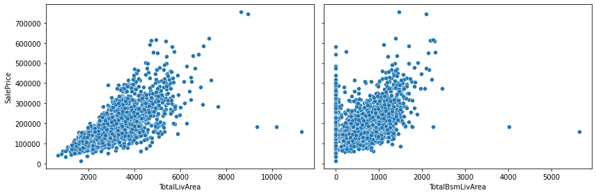
To reduce the number of features, we sum GrLivArea, 1stFlrSF and 2ndFlrSF into a single total living area, and we subtract BsmtUnfSF from TotalBsmtSF to define the finished basement area. The two new features are both positively correlated with the sale price, albeit with a few outliers.
df['TotalLivArea'] = df['GrLivArea'] + df['1stFlrSF'] + df['2ndFlrSF']
df['TotalBsmLivArea'] = df['TotalBsmtSF'] - df['BsmtUnfSF']
fig, (ax0, ax1) = plt.subplots(figsize=(12, 4), ncols=2, sharey=True)
sns.scatterplot(data=df, x="TotalLivArea", y="SalePrice", ax=ax0)
sns.scatterplot(data=df, x="TotalBsmLivArea", y="SalePrice", ax=ax1)
fig.tight_layout()
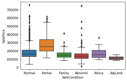
Another interesting feature is SaleCondition. Most of the sales are in the Normal category; quite a few are Partial, which from the description file means that the house was not completed, and Abnorml, that is trade, foreclosure, or short sale. Perhaps it is not a surprise that Partial houses are more expensive as they are new houses. Family and AdjLand tend to be a tad cheaper, and this is a bit expected as well and intra-family sales may be for out-of-the-market prices.
for k, v in df['SaleCondition'].value_counts().items():
    print(f'{k:8s}: {v:4d} entries ({v / len(df):4.1%})')
sns.boxplot(data=df, x='SaleCondition', y='SalePrice');
Normal  : 2397 entries (82.6%)
Partial :  245 entries (8.4%)
Abnorml :  179 entries (6.2%)
Family  :   46 entries (1.6%)
Alloca  :   22 entries (0.8%)
AdjLand :   12 entries (0.4%)
This concludes the exploratory data analysis. In Part II we will fit a linear regression model.