The data science project is taken from a kaggle competition, from which the avocado.csv file is taken. The dataset contains the average price of conventional and organic avocados in several US regions, for years 2015, 2016, 2017 and 2018.
import pandas as pd
import numpy as np
import matplotlib.pylab as plt
import random
import seaborn as sns
import warnings
warnings.simplefilter("ignore")
df = pd.read_csv('avocado.csv')
df.drop("Unnamed: 0", axis=1,inplace=True)
df['Date'] = pd.to_datetime(df['Date'])
We rename some columns to have more consistency.
df.rename(columns={'AveragePrice': 'Average Price', 'type': 'Type', 'year': 'Year', 'region': 'Region'},
          inplace=True)
We sort the data for increasing dates. This is not strickly necessary.
df = df.sort_values('Date', ascending=True)
Using the .info() we can there are no NAs in the data.
df.info()
<class 'pandas.core.frame.DataFrame'>
Int64Index: 18249 entries, 11569 to 8814
Data columns (total 13 columns):
 #   Column         Non-Null Count  Dtype
---  ------         --------------  -----
 0   Date           18249 non-null  datetime64[ns]
 1   Average Price  18249 non-null  float64
 2   Total Volume   18249 non-null  float64
 3   4046           18249 non-null  float64
 4   4225           18249 non-null  float64
 5   4770           18249 non-null  float64
 6   Total Bags     18249 non-null  float64
 7   Small Bags     18249 non-null  float64
 8   Large Bags     18249 non-null  float64
 9   XLarge Bags    18249 non-null  float64
 10  Type           18249 non-null  object
 11  Year           18249 non-null  int64
 12  Region         18249 non-null  object
dtypes: datetime64[ns](1), float64(9), int64(1), object(2)
memory usage: 1.9+ MB
It is easy to see that we have only two values for Type and four for Year.
for k, v in df['Type'].value_counts().iteritems():
    print(f"{k:>12s} => {v} entries")
for k, v in df['Year'].value_counts().iteritems():
    print(f"{k:>12d} => {v} entries")
conventional => 9126 entries
     organic => 9123 entries
        2017 => 5722 entries
        2016 => 5616 entries
        2015 => 5615 entries
        2018 => 1296 entries
sns.boxplot(x="Average Price", y="Type", data=df);
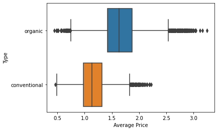
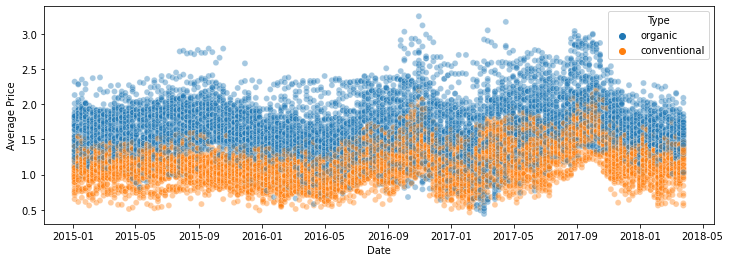
The plot above shows, as expected, that the organic type is more expensive than the conventional one, after aggregating over all dates. A plot of the average price versus the date shows, in a qualitative way, this behavoir over time.
plt.figure(figsize=(12, 4))
sns.scatterplot(x='Date', y='Average Price', hue='Type', data=df, alpha=0.4);
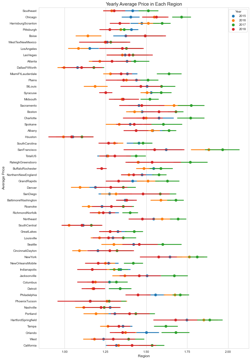
The distribution over the regions is in the plot below.
plt.figure(figsize=(12,20))
sns.set_style('whitegrid')
sns.pointplot(x='Average Price', y='Region', data=df, hue='Year', join=False)
plt.xticks(np.linspace(1,2,5))
plt.xlabel('Region', {'fontsize' : 'large'})
plt.ylabel('Average Price', {'fontsize':'large'})
plt.title("Yearly Average Price in Each Region", {'fontsize': 15});
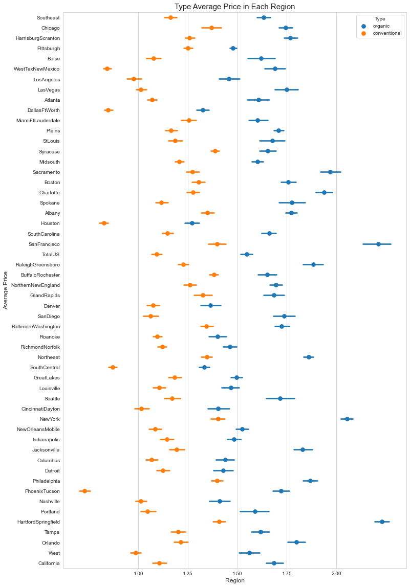
Repeating the same plot for the type shows that the highest prices for organic avocados are found in the Harford/Springfield and San Francisco regions, while the cheapest conventional ones are found in Phoenix/Tucson.
plt.figure(figsize=(12,20))
sns.set_style('whitegrid')
sns.pointplot(x='Average Price', y='Region', data=df, hue='Type', join=False)
plt.xticks(np.linspace(1,2,5))
plt.xlabel('Region', {'fontsize' : 'large'})
plt.ylabel('Average Price', {'fontsize':'large'})
plt.title("Type Average Price in Each Region", {'fontsize': 15});
The average price is weakly correlated with the other quantities in the dataset, as we can see by plotting the correlation matrix.
cols = ['Average Price', 'Total Volume', 'Small Bags', 'Large Bags', 'XLarge Bags', 'Total Bags', 'Year']
cm = np.corrcoef(df[cols].values.T)
hm = sns.heatmap(cm, vmin=-1, vmax=1, cmap='viridis', cbar=True, annot=True, square=True, fmt='.2f',
                 annot_kws={'size': 10}, yticklabels=cols, xticklabels=cols)
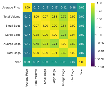
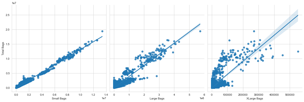
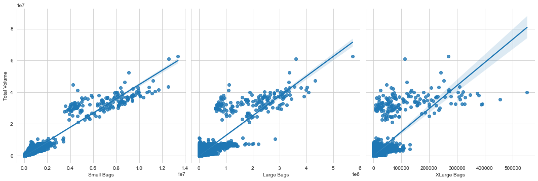
Total bags is highly correlated with small bags, but less with large and extra-large bags. The same is true for total volume, even if the plot with small bags is more scattered.
sns.pairplot(df, x_vars=['Small Bags', 'Large Bags', 'XLarge Bags'],
             y_vars='Total Bags', height=5, aspect=1, kind='reg');
sns.pairplot(df, x_vars=['Small Bags', 'Large Bags', 'XLarge Bags'],
             y_vars='Total Volume', height=5, aspect=1, kind='reg');
We now turn to the Prophet package, which is used to forecast a curve $y(t)$ over time. The assumption, which is classical in time series analysis, is that $y(t)$ can be written as the sum of three components, \(y(t) = S(t) + T(t) + R(t),\) where $S(t)$ is the seasonality component, $T(t)$ is the trend-cycle component (or just trend), and $R(t)$ is the residual part, which cannot be explained by the two previous terms. For a in-depth description, see Forecasting, Principles and Practice, by R. Hyndman and G. Athanasopoulos.
Prophet follows the classical pattern of having a fit() and a predict() methods. The method fit() takes in input a dataframe that must have two columns: ds contains the time and y contains the value we want to forecast. As we have seen that there is a strong dependency on the avocado type, we first filter out the conventional avocados and focus on the organic ones.
subset = df['Type'] == 'organic'
df_prophet = df[['Date', 'Average Price']][subset]
df_prophet = df_prophet.rename(columns={'Date': 'ds', 'Average Price': 'y'})
df_prophet
| ds | y | |
|---|---|---|
| 11569 | 2015-01-04 | 1.75 |
| 9593 | 2015-01-04 | 1.49 |
| 10009 | 2015-01-04 | 1.68 |
| 9333 | 2015-01-04 | 1.64 |
| 10269 | 2015-01-04 | 1.50 |
| ... | ... | ... |
| 17841 | 2018-03-25 | 1.75 |
| 18057 | 2018-03-25 | 1.42 |
| 17649 | 2018-03-25 | 1.74 |
| 18141 | 2018-03-25 | 1.42 |
| 17673 | 2018-03-25 | 1.70 |
9123 rows × 2 columns
from prophet import Prophet
We divide the data into a first block (75%) for training and a second block for testing (25%).
n_train = int(0.75 * len(df_prophet))
df_train, df_test = df_prophet[:n_train], df_prophet[n_train:]
print(f"Using {len(df_train)} entries for training and {len(df_test)} for testing")
Using 6842 entries for training and 2281 for testing
m = Prophet()
m.fit(df_train);
INFO:prophet:Disabling weekly seasonality. Run prophet with weekly_seasonality=True to override this.
INFO:prophet:Disabling daily seasonality. Run prophet with daily_seasonality=True to override this.
The model has been trained, so we can compute the predictions for the future 365 days from the last day of the training test. We want to compare those predictions (in blue) with the actual data (in orange).
future = m.make_future_dataframe(periods=365)
forecast = m.predict(future)
figure = m.plot(forecast, xlabel='Date', ylabel='Average Price')
plt.scatter(df_test['ds'], df_test['y'], alpha=0.4, color='orange')
<matplotlib.collections.PathCollection at 0x21d19c8e3a0>
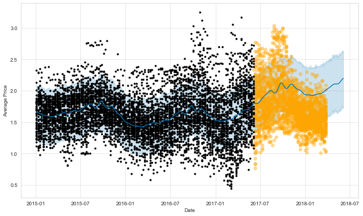
figure = m.plot_components(forecast)
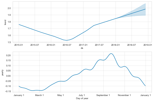
Prophet plots the trend and the yearly seasonality, since weekly and daily seasonality has been disabled. The trend shows the average price going down, while seasonality indicates higher prices in October and low ones in January to March. The results are not too bad for the first period immediately after the end of the training data, while they diverge a bit after that, seeminingly missing the trend.