This post focus on one of the UCI datasets, the bank loan marking one. We have used venv with just a few well-known packages on a Windows computer.
python -m venv .venv
.\venv\Scripts\activate.ps1
pip install numpy pandas matplotlib seaborn ipykernel scikit-learn nbconvert
pip install imbalanced-learn
pip install torch
import pandas as pd
import numpy as np
import matplotlib.pyplot as plt
import seaborn as sns
import collections
df = pd.read_csv('data/bank-additional-full.csv', sep=';')
print(f"Dataset has {len(df)} rows and {len(df.columns)} columns.")
print(f"Dataset has NAs: {df.isnull().values.any()}.")
df.head()
Dataset has 41188 rows and 21 columns.
Dataset has NAs: False.
| age | job | marital | education | default | housing | loan | contact | month | day_of_week | ... | campaign | pdays | previous | poutcome | emp.var.rate | cons.price.idx | cons.conf.idx | euribor3m | nr.employed | y | |
|---|---|---|---|---|---|---|---|---|---|---|---|---|---|---|---|---|---|---|---|---|---|
| 0 | 56 | housemaid | married | basic.4y | no | no | no | telephone | may | mon | ... | 1 | 999 | 0 | nonexistent | 1.1 | 93.994 | -36.4 | 4.857 | 5191.0 | no |
| 1 | 57 | services | married | high.school | unknown | no | no | telephone | may | mon | ... | 1 | 999 | 0 | nonexistent | 1.1 | 93.994 | -36.4 | 4.857 | 5191.0 | no |
| 2 | 37 | services | married | high.school | no | yes | no | telephone | may | mon | ... | 1 | 999 | 0 | nonexistent | 1.1 | 93.994 | -36.4 | 4.857 | 5191.0 | no |
| 3 | 40 | admin. | married | basic.6y | no | no | no | telephone | may | mon | ... | 1 | 999 | 0 | nonexistent | 1.1 | 93.994 | -36.4 | 4.857 | 5191.0 | no |
| 4 | 56 | services | married | high.school | no | no | yes | telephone | may | mon | ... | 1 | 999 | 0 | nonexistent | 1.1 | 93.994 | -36.4 | 4.857 | 5191.0 | no |
5 rows × 21 columns
Input variables:
Bank client data:
age(numeric)job: type of job (categorical: ‘admin.’,’blue-collar’,’entrepreneur’,’housemaid’,’management’,’retired’,’self-employed’,’services’,’student’,’technician’,’unemployed’,’unknown’)marital: marital status (categorical: ‘divorced’,’married’,’single’,’unknown’; note: ‘divorced’ means divorced or widowed)education(categorical: ‘basic.4y’,’basic.6y’,’basic.9y’,’high.school’,’illiterate’,’professional.course’,’university.degree’,’unknown’)default: has credit in default? (categorical: ‘no’,’yes’,’unknown’)housing: has housing loan? (categorical: ‘no’,’yes’,’unknown’)loan: has personal loan? (categorical: ‘no’,’yes’,’unknown’)
Data related with the last contact of the current campaign:
contact: contact communication type (categorical: ‘cellular’,’telephone’)month: last contact month of year (categorical: ‘jan’, ‘feb’, ‘mar’, …, ‘nov’, ‘dec’)day_of_week: last contact day of the week (categorical: ‘mon’,’tue’,’wed’,’thu’,’fri’)duration: last contact duration, in seconds (numeric). Important note: this attribute highly affects the output target (e.g., if duration=0 then y=’no’). Yet, the duration is not known before a call is performed. Also, after the end of the call y is obviously known. Thus, this input should only be included for benchmark purposes and should be discarded if the intention is to have a realistic predictive model.
Other attributes:
campaign: number of contacts performed during this campaign and for this client (numeric, includes last contact)pdays: number of days that passed by after the client was last contacted from a previous campaign (numeric; 999 means client was not previously contacted)previous: number of contacts performed before this campaign and for this client (numeric)poutcome: outcome of the previous marketing campaign (categorical: ‘failure’,’nonexistent’,’success’)
Social and economic context attributes:
emp.var.rate: employment variation rate - quarterly indicator (numeric)cons.price.idx: consumer price index - monthly indicator (numeric)cons.conf.idx: consumer confidence index - monthly indicator (numeric)euribor3m: euribor 3 month rate - daily indicator (numeric)nr.employed: number of employees - quarterly indicator (numeric)
Output variable (desired target):
y- has the client subscribed a term deposit? (binary: ‘yes’,’no’)
df = df.drop_duplicates()
print(f"Kept {len(df)} rows.")
Kept 41176 rows.
As suggested, we drop the duration.
df.drop('duration', axis=1, inplace=True)
The dataset contains both categorical and numerical types, which we want to separate in the exploratory data analysis.
df.info()
<class 'pandas.core.frame.DataFrame'>
Int64Index: 41176 entries, 0 to 41187
Data columns (total 20 columns):
 #   Column          Non-Null Count  Dtype
---  ------          --------------  -----
 0   age             41176 non-null  int64
 1   job             41176 non-null  object
 2   marital         41176 non-null  object
 3   education       41176 non-null  object
 4   default         41176 non-null  object
 5   housing         41176 non-null  object
 6   loan            41176 non-null  object
 7   contact         41176 non-null  object
 8   month           41176 non-null  object
 9   day_of_week     41176 non-null  object
 10  campaign        41176 non-null  int64
 11  pdays           41176 non-null  int64
 12  previous        41176 non-null  int64
 13  poutcome        41176 non-null  object
 14  emp.var.rate    41176 non-null  float64
 15  cons.price.idx  41176 non-null  float64
 16  cons.conf.idx   41176 non-null  float64
 17  euribor3m       41176 non-null  float64
 18  nr.employed     41176 non-null  float64
 19  y               41176 non-null  object
dtypes: float64(5), int64(4), object(11)
memory usage: 6.6+ MB
columns_num = ['age', 'campaign', 'pdays', 'previous', 'emp.var.rate', 'cons.price.idx',
               'cons.conf.idx', 'euribor3m', 'nr.employed']
columns_cat = ['job', 'marital', 'education', 'default', 'housing', 'loan', 'contact',
               'month', 'day_of_week', 'poutcome']
assert len(df.columns) == len(columns_num) + len(columns_cat) + 1
df.describe(include='all').T
| count | unique | top | freq | mean | std | min | 25% | 50% | 75% | max | |
|---|---|---|---|---|---|---|---|---|---|---|---|
| age | 41176.0 | NaN | NaN | NaN | 40.0238 | 10.42068 | 17.0 | 32.0 | 38.0 | 47.0 | 98.0 |
| job | 41176 | 12 | admin. | 10419 | NaN | NaN | NaN | NaN | NaN | NaN | NaN |
| marital | 41176 | 4 | married | 24921 | NaN | NaN | NaN | NaN | NaN | NaN | NaN |
| education | 41176 | 8 | university.degree | 12164 | NaN | NaN | NaN | NaN | NaN | NaN | NaN |
| default | 41176 | 3 | no | 32577 | NaN | NaN | NaN | NaN | NaN | NaN | NaN |
| housing | 41176 | 3 | yes | 21571 | NaN | NaN | NaN | NaN | NaN | NaN | NaN |
| loan | 41176 | 3 | no | 33938 | NaN | NaN | NaN | NaN | NaN | NaN | NaN |
| contact | 41176 | 2 | cellular | 26135 | NaN | NaN | NaN | NaN | NaN | NaN | NaN |
| month | 41176 | 10 | may | 13767 | NaN | NaN | NaN | NaN | NaN | NaN | NaN |
| day_of_week | 41176 | 5 | thu | 8618 | NaN | NaN | NaN | NaN | NaN | NaN | NaN |
| campaign | 41176.0 | NaN | NaN | NaN | 2.567879 | 2.770318 | 1.0 | 1.0 | 2.0 | 3.0 | 56.0 |
| pdays | 41176.0 | NaN | NaN | NaN | 962.46481 | 186.937102 | 0.0 | 999.0 | 999.0 | 999.0 | 999.0 |
| previous | 41176.0 | NaN | NaN | NaN | 0.173013 | 0.494964 | 0.0 | 0.0 | 0.0 | 0.0 | 7.0 |
| poutcome | 41176 | 3 | nonexistent | 35551 | NaN | NaN | NaN | NaN | NaN | NaN | NaN |
| emp.var.rate | 41176.0 | NaN | NaN | NaN | 0.081922 | 1.570883 | -3.4 | -1.8 | 1.1 | 1.4 | 1.4 |
| cons.price.idx | 41176.0 | NaN | NaN | NaN | 93.57572 | 0.578839 | 92.201 | 93.075 | 93.749 | 93.994 | 94.767 |
| cons.conf.idx | 41176.0 | NaN | NaN | NaN | -40.502863 | 4.62786 | -50.8 | -42.7 | -41.8 | -36.4 | -26.9 |
| euribor3m | 41176.0 | NaN | NaN | NaN | 3.621293 | 1.734437 | 0.634 | 1.344 | 4.857 | 4.961 | 5.045 |
| nr.employed | 41176.0 | NaN | NaN | NaN | 5167.03487 | 72.251364 | 4963.6 | 5099.1 | 5191.0 | 5228.1 | 5228.1 |
| y | 41176 | 2 | no | 36537 | NaN | NaN | NaN | NaN | NaN | NaN | NaN |
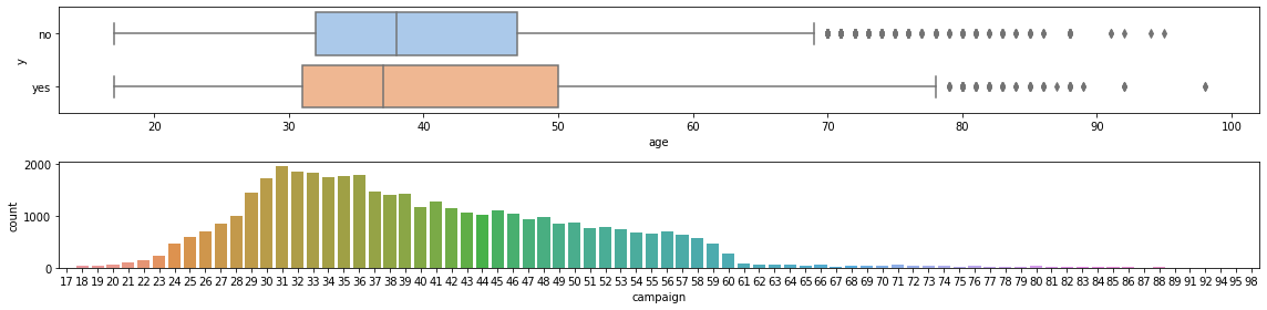
Let’s start with the numerical features. The first one is ‘age’, that goes from 17 to 98. Most of the clients are abour 30 and 50; the mean is a bit above 40, with a standard derivation of about 10. The boxplot shows a few outliers, which we remove.
fig, (ax0, ax1) = plt.subplots(2, 1, figsize=(16, 4))

sns.boxplot(ax=ax0, x='age', y='y', data=df, palette="pastel")
ax0.set_ylabel('y')

sns.countplot(ax=ax1, x='age', data=df)
ax1.set_xlabel("campaign")
ax1.set_ylabel("count")
fig.tight_layout()
for target in ['yes', 'no']:
    Q1 = df[df.y == target].age.quantile(0.25)
    Q3 = df[df.y == target].age.quantile(0.75)
    IQR = Q3 - Q1
    filter = (((df.age < (Q1 - 1.5 * IQR)) | (df.age > (Q3 + 1.5 * IQR))) & (df.y == target))
    df = df[~filter]
print(f"Kept {len(df)} rows.")
Kept 40845 rows.
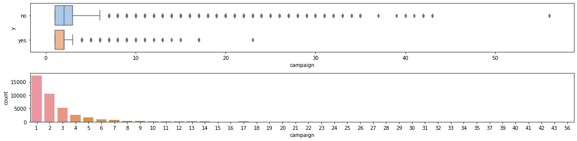
The column campaign reports the number of contacts made in the campaign
to a single client. The minimum is 1 and the maximum 56; the mean is 2.57.
There are several outliers, which we will removed as well. It seems there are less contacts
for those who took the loan, probably because such people are no longer called, while those
who do not take a loan are called again.
fig, (ax0, ax1) = plt.subplots(2,1, figsize=(16, 4))

sns.boxplot(ax=ax0, x='campaign', y='y', data=df, palette="pastel")
ax0.set_ylabel('y')

sns.countplot(ax=ax1, x='campaign', data=df)
ax1.set_xlabel("campaign")
ax1.set_ylabel("count")
fig.tight_layout()
for target in ['yes', 'no']:
    Q1 = df[df.y == target].campaign.quantile(0.25)
    Q3 = df[df.y == target].campaign.quantile(0.75)
    IQR = Q3 - Q1
    filter = (((df.campaign < (Q1 - 1.5 * IQR)) | (df.campaign > (Q3 + 1.5 * IQR))) & (df.y == target))
    df = df[~filter]
print(f"Kept {len(df)} rows.")
Kept 38009 rows.
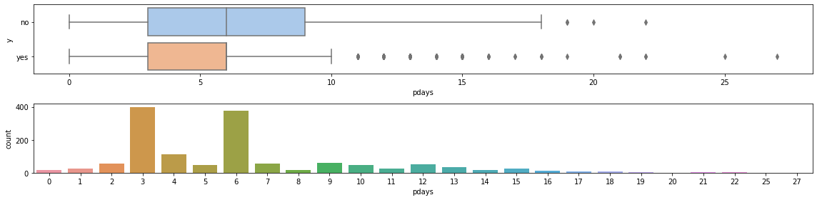
The column pdays contains the number of days that passed by after the client was last contacted from a previous campaign. We remove the -999 in the graphs. There are a few outliers, but we keep them.
fig, (ax0, ax1) = plt.subplots(2,1, figsize=(16, 4))

sns.boxplot(ax=ax0, x='pdays', y='y', data=df[df['pdays'] != 999], palette="pastel")
ax0.set_ylabel('y')

sns.countplot(ax=ax1, x='pdays', data=df[df['pdays'] != 999])
ax1.set_xlabel("pdays")
ax1.set_ylabel("count")
fig.tight_layout()
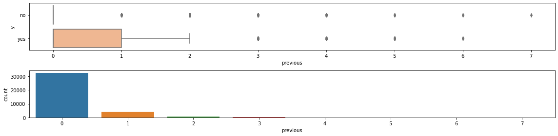
The column previous contains the number of contacts performed before this campaign and for this client.
It seems that previous contacts were effective.
fig, (ax0, ax1) = plt.subplots(2,1, figsize=(16, 4))

sns.boxplot(ax=ax0, x='previous', y='y', data=df, palette="pastel")
ax0.set_ylabel('y')

sns.countplot(ax=ax1, x='previous', data=df)
ax1.set_xlabel("previous")
ax1.set_ylabel("count")
fig.tight_layout()
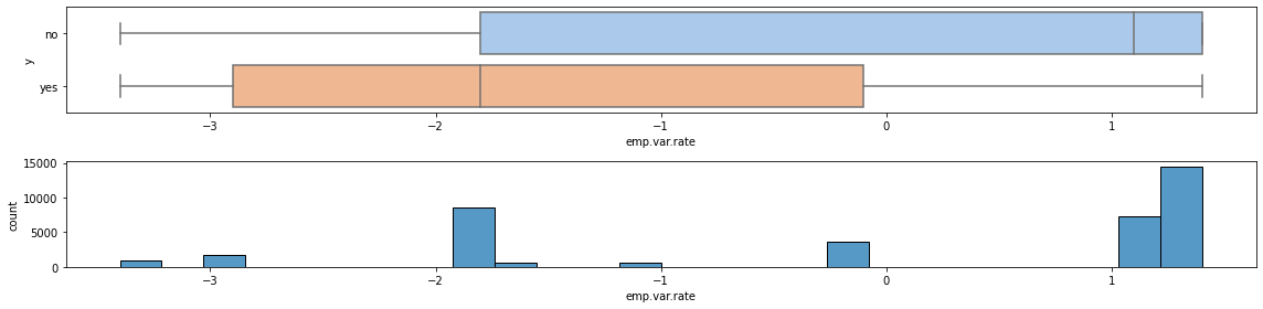
We now look at the economic indicators, starting with emp.var.rate. From the boxplot, it doesn’t look like it has a great impact.
fig, (ax0, ax1) = plt.subplots(2,1, figsize=(16, 4))

sns.boxplot(ax=ax0, x='emp.var.rate', y='y', data=df, palette="pastel")
ax0.set_ylabel('y')

sns.histplot(ax=ax1, x='emp.var.rate', data=df)
ax1.set_xlabel("emp.var.rate")
ax1.set_ylabel("count")
fig.tight_layout()
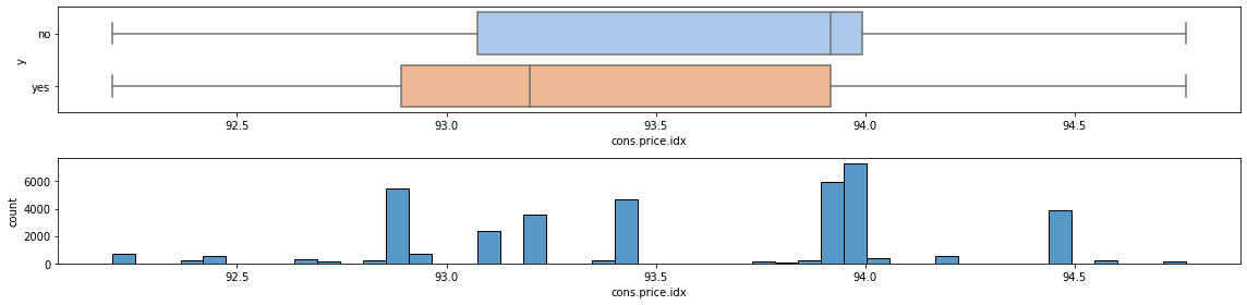
The same can be said of cons.price.idx.
fig, (ax0, ax1) = plt.subplots(2,1, figsize=(16, 4))

sns.boxplot(ax=ax0, x='cons.price.idx', y='y', data=df, palette="pastel")
ax0.set_ylabel('y')

sns.histplot(ax=ax1, x='cons.price.idx', data=df)
ax1.set_xlabel("cons.price.idx")
ax1.set_ylabel("count")
fig.tight_layout()
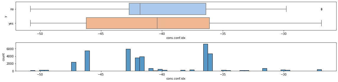
Idem for cons.conf.idx.
fig, (ax0, ax1) = plt.subplots(2,1, figsize=(16, 4))

sns.boxplot(ax=ax0, x='cons.conf.idx', y='y', data=df, palette="pastel")
ax0.set_ylabel('y')

sns.histplot(ax=ax1, x='cons.conf.idx', data=df)
ax1.set_xlabel("cons.conf.idx")
ax1.set_ylabel("count")
fig.tight_layout()
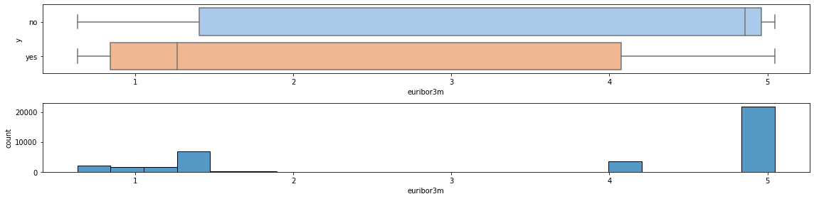
The boxplot for column euribor3m may suggest a weak dependency on the interest rate, as expected – the higher the reference rate, the more expensive the loan is, with an inverse relationship between euribor3m and y.
fig, (ax0, ax1) = plt.subplots(2,1, figsize=(16, 4))

sns.boxplot(ax=ax0, x='euribor3m', y='y', data=df, palette="pastel")
ax0.set_ylabel('y')

sns.histplot(ax=ax1, x='euribor3m', data=df)
ax1.set_xlabel("euribor3m")
ax1.set_ylabel("count")
fig.tight_layout()
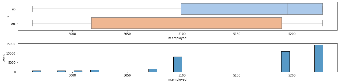
A similar conclusion holds also for nr.employed.
fig, (ax0, ax1) = plt.subplots(2,1, figsize=(16, 4))

sns.boxplot(ax=ax0, x='nr.employed', y='y', data=df, palette="pastel")
ax0.set_ylabel('y')

sns.histplot(ax=ax1, x='nr.employed', data=df)
ax1.set_xlabel("nr.employed")
ax1.set_ylabel("count")
fig.tight_layout()
Now we give a look at the categorical features, first with an overview of all the unique values for all of them, then by plotting the distribution of the target for each feature individually.
for en, i in enumerate(columns_cat):
    print(f"'{columns_cat[en]}', unique values:", ', '.join(df[i].unique()))
'job', unique values: housemaid, services, admin., blue-collar, technician, retired, management, unemployed, self-employed, unknown, entrepreneur, student
'marital', unique values: married, single, divorced, unknown
'education', unique values: basic.4y, high.school, basic.6y, basic.9y, professional.course, unknown, university.degree, illiterate
'default', unique values: no, unknown, yes
'housing', unique values: no, yes, unknown
'loan', unique values: no, yes, unknown
'contact', unique values: telephone, cellular
'month', unique values: may, jun, jul, aug, oct, nov, dec, mar, apr, sep
'day_of_week', unique values: mon, tue, wed, thu, fri
'poutcome', unique values: nonexistent, failure, success
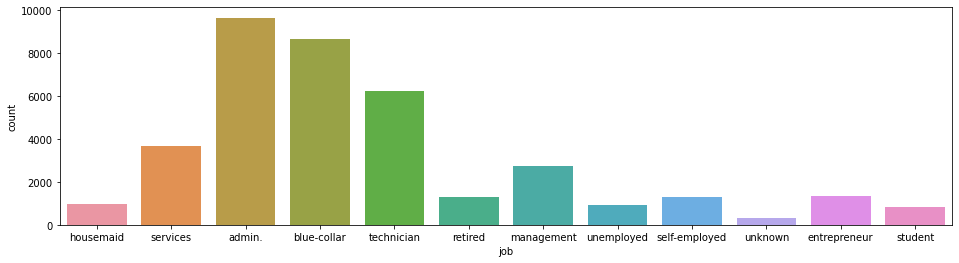
Column job shows that some categories (admin, blue-collar, technician) are much more represented than others.
Not unexpectedly other categories like student, unemployed and retired are little represented. Category
entrepreneur is not very much represented, perhaps because there are not too many or because they already have loans
with the bank.
plt.figure(figsize=(16, 4))
_ = sns.countplot(data=df, x='job')
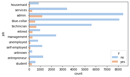
Subdividing the counts by yes or no shows that housemaid, student, unemployed and entrepreneur are
not very likely to take the loan.
_ = sns.countplot(y='job', hue='y', data=df, palette='pastel')
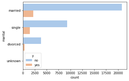
The marital status does not seem to influence much.
_ = sns.countplot(y='marital', hue='y', data=df, palette='pastel')
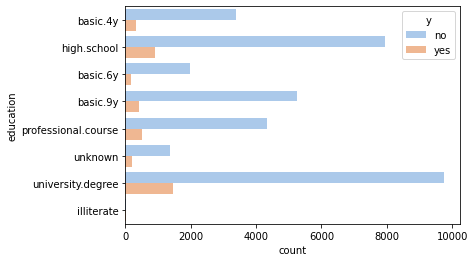
The degree of education seems to correlate positively with the probability of taking the loan: clients
with high.school or university.degree are more likely to result in a yes than clients with
less education. This can be that higher education improves the knowledge of what a loan is and when
it is convenient to take it, but also can be that it correlates with higher pay (and perhaps a
more expensive lifestyle).
_ = sns.countplot(y='education', hue='y', data=df, palette='pastel')
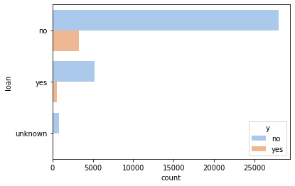
_ = sns.countplot(y='loan', hue='y', data=df, palette='pastel')
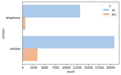
The type of contact is important, with cellular being more likely to result in a loan than telephone.
_ = sns.countplot(y='contact', hue='y', data=df, palette='pastel')
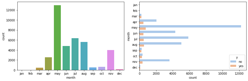
The month of the year is clearly important – most contacts happen in May, and continue during summer. Little happens in winter and almost nothing in autumn, expect for November.
fig, (ax0, ax1) = plt.subplots(figsize=(12, 4), ncols=2)
months = ['jan', 'feb', 'mar', 'apr', 'may', 'jun', 'jul', 'aug', 'sep', 'oct', 'nov', 'dec']
sns.countplot(x='month', data=df, ax=ax0, order=months)
_ = sns.countplot(y='month', hue='y', data=df, palette='pastel', ax=ax1, order=months)
fig.tight_layout()
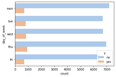
The day of the week seems to hold little explanatory power.
_ = sns.countplot(y='day_of_week', hue='y', data=df, palette='pastel')
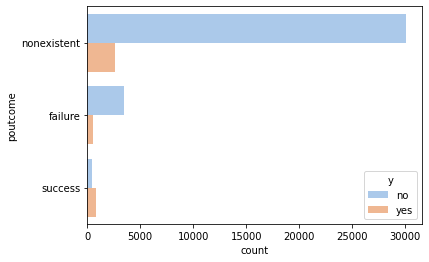
_ = sns.countplot(y='poutcome', hue='y', data=df, palette='pastel')
Finally, let’s give a look at the variable y. The success rate of the campaign, from the data
provided, is just below 12%. That is, out of 9 contacted customers, one took the loan and the other 8 didn’t.
The dataset is quite unbalanced, as no is much more represented than yes: a trivial (and useless) model
returning no for any input would score an accuracy of 89%.
success_rate = sum(df['y'] == 'yes') / sum(df['y'] == 'no')
print(f"Marketing campain success rate: {success_rate:.2%}.")
Marketing campain success rate: 11.77%.
df_num = df[columns_num]
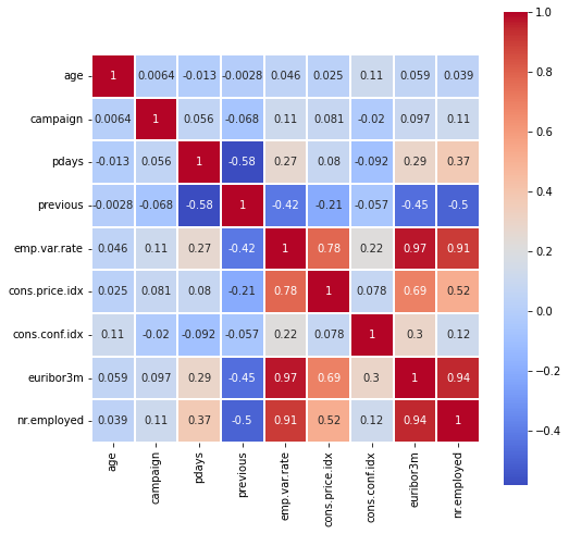
Now we will look at the correlation between the numerical values.
It is surprising that previous is well correlated with the macroeconomic indicators: the correlation is
-0.42 with emp.var.rate, -0.45 with euribor3m, -0.5 with nr.employed, and -0.21 with cons.price.idx.
As previous is the number of contants before this campaign, it suggests that the bank runs more
such campaigns when the economic conditions are good. The economic indicators are also very much correlated to each other
– emp.var.rate has a correlation of 0.78 with cons.price.idx, of 0.97 with euribor3m, and of 0.91 with nr.emplyed.
Features pdays and previous are well correlated.
fig = plt.figure(figsize=(8, 8))
corr = df_num.corr()
_ = sns.heatmap(corr, cmap="coolwarm", square=True, linewidth=0.1, annot=True)
df = df.replace(['yes','no'], [1,0])
df_numerical = pd.get_dummies(df)
print(f"Expanded number of columsn: df_numerical.shape[1]")
Expanded number of columsn: df_numerical.shape[1]
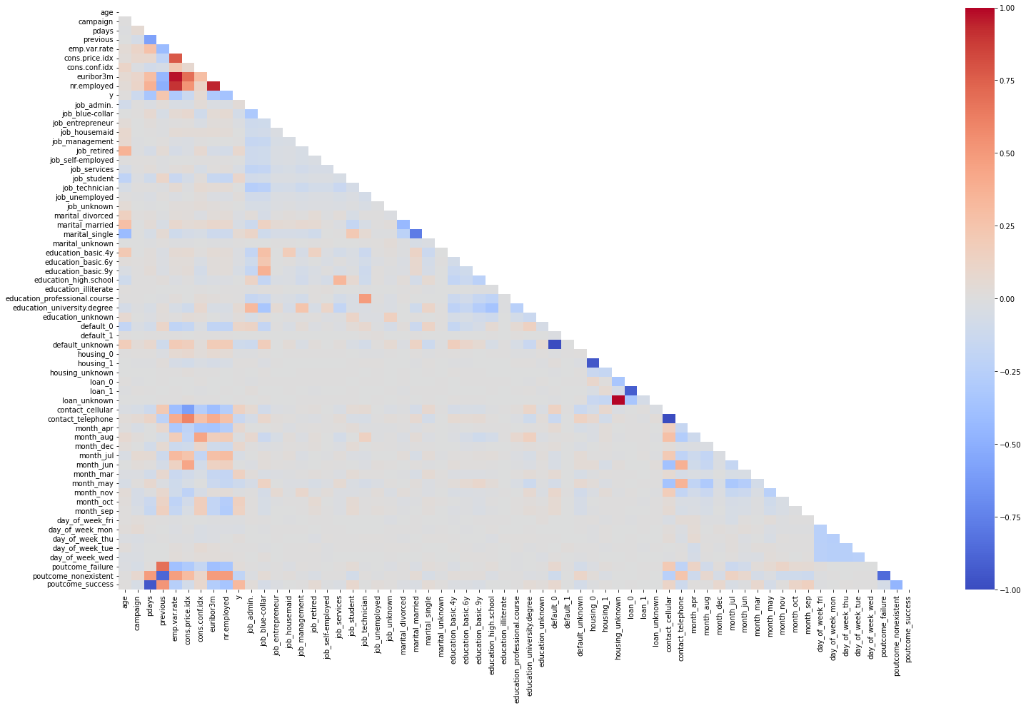
plt.figure(figsize=(25,15))
mask = np.triu(np.ones_like(df_numerical.corr(), dtype=bool))

heatmap = sns.heatmap(df_numerical.corr(), vmin = -1, vmax = 1,cmap="coolwarm", annot=False, mask=mask)
We are ready for the prediction model: we separate the features from the target, creating a X and y.
X = df_numerical.drop('y', axis=1)
y = df_numerical['y']
As clear from all the graphs above, this dataset is severaly unbalanced, so using it directly isn’t a good idea. Instead,
we either need to downsample the dataset by reducing the rows corresponding to the no-loan case, or oversample it.
The first approach is simple but results in a smaller dataset; the second is more interesting and this is the one we will follow,
adopting in particular the SMOTE technique. The code requires the imbalance-learn library, which is easily installed using pip.
from imblearn.over_sampling import SMOTE
oversample = SMOTE()
X, y = oversample.fit_resample(X, y)
print(f"The dataset now has {len(X)} rows.")
The dataset now has 68010 rows.
As customary, we split the dataset into train and test. The partition is stratified over y, meaning that the train
and test datasets will have the same class distribution as the original dataset.
For scaling (on the train dataset) we use the standard scaler.
from sklearn.model_selection import train_test_split
from sklearn.preprocessing import StandardScaler
X_train, X_test, y_train, y_test = train_test_split(X, y, test_size=0.2, stratify=y)
scaler = StandardScaler()
X_train  = scaler.fit_transform(X_train)
X_test = scaler.transform(X_test)
from sklearn.linear_model import LogisticRegression
from sklearn.ensemble import GradientBoostingClassifier
from sklearn.svm import SVC
from sklearn.model_selection import cross_val_score
from sklearn.metrics import confusion_matrix, roc_auc_score, classification_report
As a (trivial) baseline, simply use a zero vector. Unsurprisingly, the precision is 50%.
print(f"ROC AUC score: {roc_auc_score(y_test, np.zeros_like(y_test)):.2%}")
print(classification_report(y_test, np.zeros_like(y_test), zero_division=False))
ROC AUC score: 50.00%
              precision    recall  f1-score   support

           0       0.50      1.00      0.67      6801
           1       0.00      0.00      0.00      6801

    accuracy                           0.50     13602
   macro avg       0.25      0.50      0.33     13602
weighted avg       0.25      0.50      0.33     13602
def analyze(y_exact, y_pred):
    cm = confusion_matrix(y_exact, y_pred)
    classes = ["True Negative","False Positive","False Negative","True Positive"]
    values = ["{0:0.0f}".format(x) for x in cm.flatten()]
    percentages = ["{0:.1%}".format(x) for x in cm.flatten() / np.sum(cm)]
    combined = [f"{i}\n{j}\n{k}" for i, j, k in zip(classes, values, percentages)]
    combined = np.asarray(combined).reshape(2, 2)
    heatmap = sns.heatmap(cm / np.sum(cm), annot=combined, fmt='', cmap='YlGnBu')
    heatmap.set(title='Confusion Matrix')
    heatmap.set(xlabel='Predicted', ylabel='Actual')
    print(f"ROC AUC score: {roc_auc_score(y_exact, y_pred):.2%}")
    print(classification_report(y_exact, y_pred))
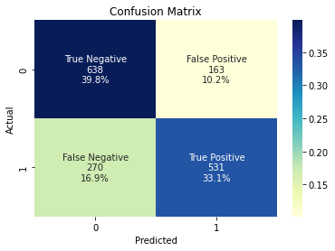
A more reasonable baseline is linear regression.
lr = LogisticRegression()
lr.fit(X_train, y_train)
y_pred = lr.predict(X_test)
analyze(y_test, y_pred)
ROC AUC score: 72.97%
              precision    recall  f1-score   support

           0       0.70      0.80      0.75       801
           1       0.77      0.66      0.71       801

    accuracy                           0.73      1602
   macro avg       0.73      0.73      0.73      1602
weighted avg       0.73      0.73      0.73      1602
With gradient boosting:
gbc = GradientBoostingClassifier(max_depth=5)
gbc.fit(X_train, y_train)
y_pred = gbc.predict(X_test)
analyze(y_test, y_pred)
ROC AUC score: 93.43%
              precision    recall  f1-score   support

           0       0.92      0.96      0.94      6801
           1       0.95      0.91      0.93      6801

    accuracy                           0.93     13602
   macro avg       0.94      0.93      0.93     13602
weighted avg       0.94      0.93      0.93     13602
svc = SVC()
svc.fit(X_train, y_train)
y_pred = svc.predict(X_test)
analyze(y_test, y_pred)
ROC AUC score: 94.28%
              precision    recall  f1-score   support

           0       0.91      0.98      0.94      6801
           1       0.98      0.91      0.94      6801

    accuracy                           0.94     13602
   macro avg       0.94      0.94      0.94     13602
weighted avg       0.94      0.94      0.94     13602

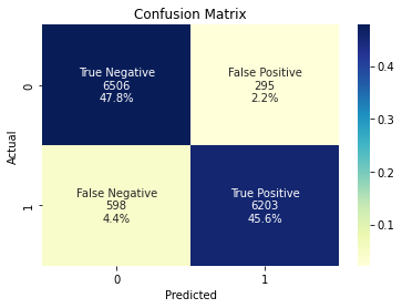
With PyTorch:
import torch
from torch import nn, optim
from torch.nn import functional as F
from torch.utils.data import Dataset, DataLoader
X_train_t = torch.from_numpy(X_train).float()
X_test_t = torch.from_numpy(X_test).float()
y_train_t = torch.from_numpy(y_train.values).float()
y_test_t = torch.from_numpy(y_test.values).float()
class Net(nn.Module):

    def __init__(self):
        super().__init__()
        self.fc1 = nn.Linear(X.shape[1], 32)
        self.bn1 = nn.BatchNorm1d(32)
        self.fc2 = nn.Linear(32, 32)
        self.fc3 = nn.Linear(32, 16)
        self.fc4 = nn.Linear(16, 1)

    def forward(self, x):
        x = F.leaky_relu(self.fc1(x))
        x = self.bn1(x)
        x = F.leaky_relu(self.fc2(x))
        x = F.leaky_relu(self.fc3(x))
        x = torch.sigmoid(self.fc4(x))
        return x
class BankDataset(Dataset):

    def __init__(self, X_data, y_data):
        self.X_data = X_data
        self.y_data = y_data

    def __getitem__(self, index):
        return self.X_data[index], self.y_data[index]

    def __len__ (self):
        return len(self.X_data)
dataset_train = BankDataset(X_train_t, y_train_t)
data_loader = DataLoader(dataset=dataset_train, batch_size=1_024, shuffle=True)
net = Net()
optimizer = optim.Adam(net.parameters(), lr=1e-3)
criterion = nn.BCELoss()
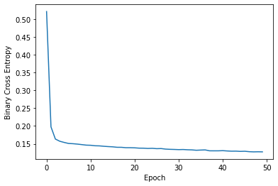
losses = []
for epoch in range(1, 51):
total_loss = 0.0
for X_batch, y_batch in data_loader:
optimizer.zero_grad()
y_pred = net(X_batch).flatten()
loss = criterion(y_pred, y_batch)
loss.backward()
optimizer.step()
total_loss += loss.item() * len(X_batch)
losses.append(total_loss / len(dataset_train))
plt.plot(losses)
plt.xlabel('Epoch')
plt.ylabel('Binary Cross Entropy');
Text(0, 0.5, 'Binary Cross Entropy')
y_pred = net(X_test_t).detach().numpy().round().flatten()
analyze(y_test, y_pred)
ROC AUC score: 94.44%
              precision    recall  f1-score   support

           0       0.92      0.98      0.95      6801
           1       0.97      0.91      0.94      6801

    accuracy                           0.94     13602
   macro avg       0.95      0.94      0.94     13602
weighted avg       0.95      0.94      0.94     13602
