I have followed https://www.kaggle.com/shubhammaheshwari1/sunspots-analysis for the exploratory data analysis.
import matplotlib.pylab as plt
import pandas as pd
import seaborn as sns
df = pd.read_csv('Sunspots.csv', sep=',')
df = df.drop(columns=['Unnamed: 0'])
df = df.rename(columns={'Date': 'ds', 'Monthly Mean Total Sunspot Number': 'y'})
df['ds'] = df['ds'].apply(pd.to_datetime)
assert df['ds'].is_monotonic_increasing
print(f"Found {len(df)} entries.")
Found 3265 entries.
df.info()
<class 'pandas.core.frame.DataFrame'>
RangeIndex: 3265 entries, 0 to 3264
Data columns (total 2 columns):
 #   Column  Non-Null Count  Dtype
---  ------  --------------  -----
 0   ds      3265 non-null   datetime64[ns]
 1   y       3265 non-null   float64
dtypes: datetime64[ns](1), float64(1)
memory usage: 51.1 KB
df.describe()
| y | |
|---|---|
| count | 3265.000000 |
| mean | 81.778775 |
| std | 67.889277 |
| min | 0.000000 |
| 25% | 23.900000 |
| 50% | 67.200000 |
| 75% | 122.500000 |
| max | 398.200000 |
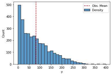
A histogram plot shows that the distribution of the observatios is not normal at all, and rather skewed. Obviously the monthly count cannot be negative, yet numbers are mostly small, with a few large numbers that are quite far away from the mean. The frequencies are decreasing quite regularly.
sns.histplot(df['y'], label='Density')
plt.axvline(x=df['y'].mean(), color='red', linestyle='dashed', label='Obs. Mean')
plt.legend()
<matplotlib.legend.Legend at 0x19c0eac98b0>
plt.figure(figsize=(12, 4))
plt.plot(df['ds'], df['y'])
plt.xlabel('Observation Date')
plt.title('Monthly Mean Total Sunspot Numbers');
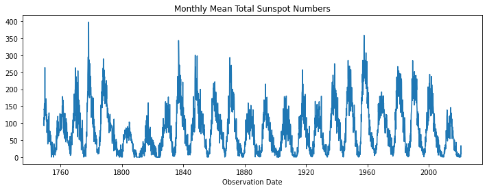
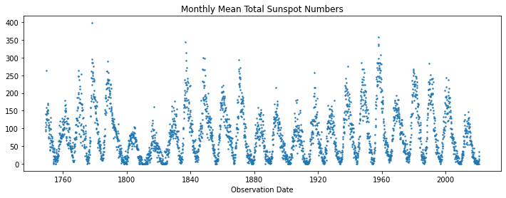
Too many connecting lines can clutter the picture, so we also produce a scatter plot that shows with a bit more clarity the structure of the data. The cycles are more evident, and it also clear that there are more observations with small values, as we have seen in the density plot above. So low observations are ‘sticky’, while large observations change rapidly and seem more irregular, although they generally fade quickly. Another way of saying this is that points are dense around local minima and sparse around local maxima. This suggests that the change in sunspot numbers is large and quick around local maxima (during the rise and subsequent fall) in comparison to the changes near local minima
plt.figure(figsize=(12, 4))
plt.scatter(df['ds'], df['y'], s=2)
plt.xlabel('Observation Date')
plt.title('Monthly Mean Total Sunspot Numbers');
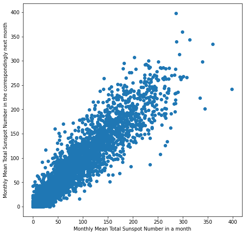
Our next plot is a lag plot. Lag plots are useful for checking whether the data is random or not. If there is an observable pattern in the lag plot, we can leverage that information to make predictions. The plot shows positive correlation, so data is not random and it makes sense to try to forecast the time series. Positive correlation means that when the number of sunspots rises one day, it will keep rising the day after (and viceversa).
plt.figure(figsize=(8, 8))
plt.scatter(df['y'], df['y'].shift(1))
plt.xlabel('Monthly Mean Total Sunspot Number in a month')
plt.ylabel('Monthly Mean Total Sunspot Number in the correspondingly next month');
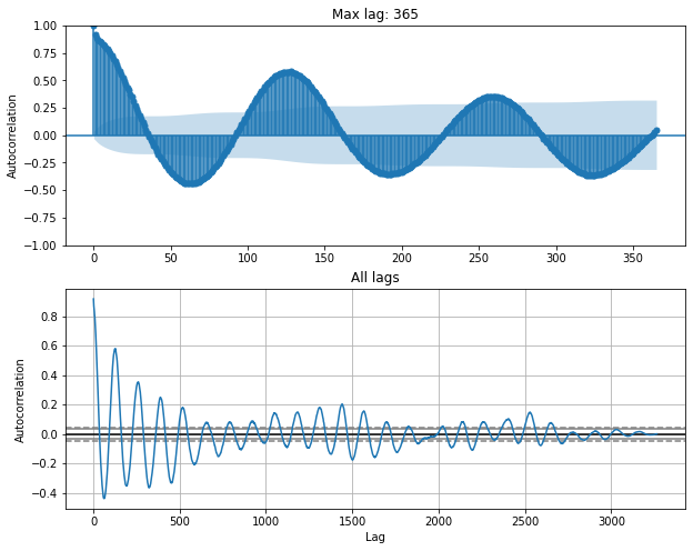
from statsmodels.graphics.tsaplots import plot_acf, plot_pacf
fig, (ax0, ax1) = plt.subplots(figsize=(10, 8), nrows=2)
plot_acf(df['y'], ax=ax0, lags=365)
ax0.set_title('Max lag: 365')
ax0.set_ylabel('Autocorrelation')
pd.plotting.autocorrelation_plot(df['y'], ax=ax1)
ax1.set_title('All lags')
Text(0.5, 1.0, 'All lags')
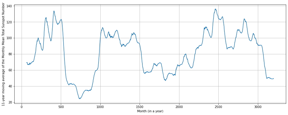
rolling_avg = df['y'].rolling(window = 12 * 11, closed = 'both', center =  True).mean()
rolling_avg.plot(figsize = (16,6),grid = True, xlabel = 'Month (in a year)', ylabel = '11-year moving average of the Monthly Mean Total Sunspot Number')
<AxesSubplot:xlabel='Month (in a year)', ylabel='11-year moving average of the Monthly Mean Total Sunspot Number'>
y = df['y'].copy()
y.index = df['ds']
y.drop(pd.to_datetime('2021-01-31'), inplace=True)
year_groups = y.groupby(pd.Grouper(freq='Y'))
df_years = pd.DataFrame()
for year, group in year_groups:
df_years[year.year] = group.values
# df_years is a dataframe with a column for each year in the data, and a row for every month within that year
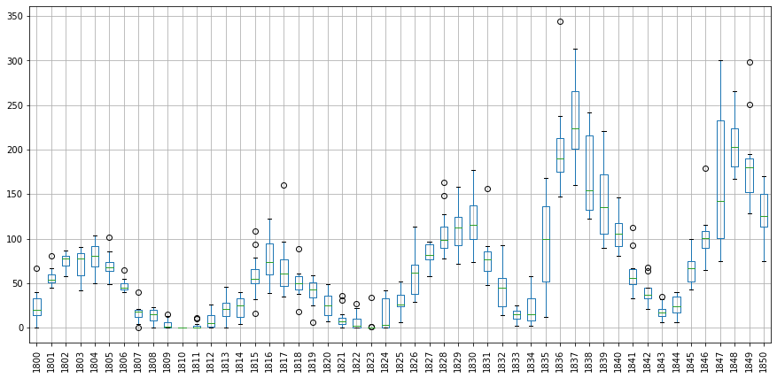
# boxplots for sunspot data between the years 1950 and 2000
df_years.loc[:,1800:1850].boxplot(figsize = (15,7), rot = 90)
C:\Users\dragh\AppData\Local\Temp/ipykernel_5372/1480639849.py:5: PerformanceWarning: DataFrame is highly fragmented.  This is usually the result of calling `frame.insert` many times, which has poor performance.  Consider joining all columns at once using pd.concat(axis=1) instead.  To get a de-fragmented frame, use `newframe = frame.copy()`
  df_years[year.year] = group.values


<AxesSubplot:>
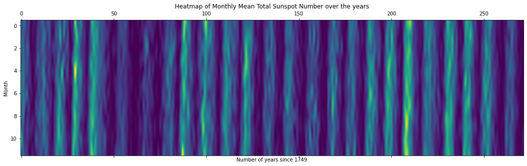
fig, ax = plt.subplots(figsize=(18, 5))
ax.matshow(df_years, interpolation='lanczos', aspect='auto')
ax.set_xlabel('Number of years since 1749')
ax.set_ylabel('Month')
ax.set_title('Heatmap of Monthly Mean Total Sunspot Number over the years');
import numpy as np
from scipy.signal import argrelextrema
order = 12*4
argrelextrema(y.values, np.greater, order=order)[0]
local_maxima = y[argrelextrema(y.values, np.greater, order=order)[0]]
local_maxima.sort_values(ascending = False)
local_maxima.plot(grid=True, figsize=(15,5), style='o-', ylabel='Monthly Mean Total Sunspot Number',
                  xlabel='Month (in a year)', title='Local maxima in monthly mean sunspot numbers')
print(f"We have {local_maxima.count()} maxima.")
We have 25 maxima.
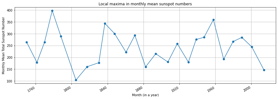
cycles = np.diff(local_maxima.index.year)
print(f"Mean cycle length: {cycles.mean():.2f} years.")
Mean cycle length: 11.04 years.
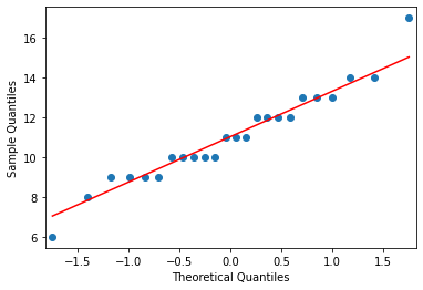
from statsmodels.graphics.gofplots import qqplot
qqplot(cycles, line='s');