In this post we look at time series forecasts. A time series is a set of data points ordered in time. Our aim is to forecast the average monthly temperature in the city of Rome. We will use a dataset that contains data on global land temperatures by city, part of the Berkeley Earth climate data. It includes historical temperature records and is useful for studying climate change and local temperature variations over time. Our data is equally spaced in time; we focus on the period from 1900 to 2012, both inclusive.
import matplotlib.pylab as plt
import numpy as np
import pandas as pd
import seaborn as sns
sns.set_style('darkgrid')
import warnings
warnings.filterwarnings('ignore')
cities = pd.read_csv('./GlobalLandTemperaturesByMajorCity.csv')
df = cities.loc[cities['City'] == 'Rome', ['dt','AverageTemperature']]
df.columns = ['date', 'y']
df['date'] = pd.to_datetime(df['date'])
df['year'] = df['date'].dt.year
df['month'] = df['date'].dt.strftime('%b')
df.reset_index(drop=True, inplace=True)
df.set_index('date', inplace=True)
df = df.loc['1900':'2012']
df = df.asfreq('M', method='bfill')
df.tail()
| y | year | month | |
|---|---|---|---|
| date | |||
| 2012-07-31 | 24.731 | 2012 | Aug |
| 2012-08-31 | 18.922 | 2012 | Sep |
| 2012-09-30 | 14.501 | 2012 | Oct |
| 2012-10-31 | 10.528 | 2012 | Nov |
| 2012-11-30 | 4.150 | 2012 | Dec |
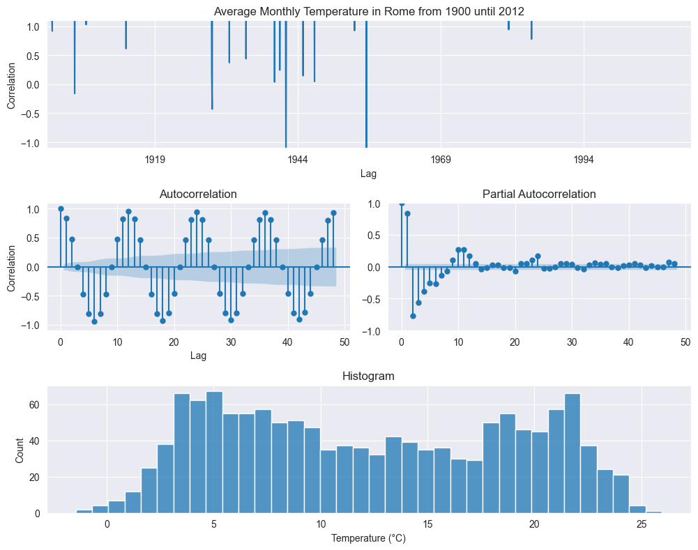
We start with the exploratoring analysis. Plotting all the data over times shows an oscillating behavior, as expected due to the seasonality of the temperature, but this graph is too cluttered to deliver any actionable information. More meaningful are the autocorrelation and partial autocorrelation plots. The former shows a strong anticorrelation with six months lag (from summer to winter) and a strong correlation with twelve months (from year to year). The histogram points to a bimodal distributions, with two peaks.
from statsmodels.graphics.tsaplots import plot_acf, plot_pacf

y = df.y.dropna()
fig = plt.figure(figsize=(15, 8))

ax1 = plt.subplot2grid((3, 3), (0, 0), colspan=2)
ax2 = plt.subplot2grid((3, 3), (1, 0))
ax3 = plt.subplot2grid((3, 3), (1, 1))
ax4 = plt.subplot2grid((3, 3), (2, 0), colspan=2)

y.plot(ax=ax1)
ax1.set_title('Average Monthly Temperature in Rome from 1900 until 2012')
ax1.set_xlabel('Year')
ax1.set_ylabel('Temperature (°C)')
plot_acf(y, lags=48, zero=True, ax=ax2);
ax1.set_xlabel('Lag')
ax1.set_ylabel('Correlation')
ax1.set_ylim(-1.1, 1.1)
plot_pacf(y, lags=48, zero=True, ax=ax3);
ax2.set_xlabel('Lag')
ax2.set_ylabel('Correlation')
ax2.set_ylim(-1.1, 1.1)
sns.histplot(y, bins=int(np.sqrt(len(y))), ax=ax4)
ax4.set_title('Histogram')
ax4.set_xlabel('Temperature (°C)')
plt.tight_layout()
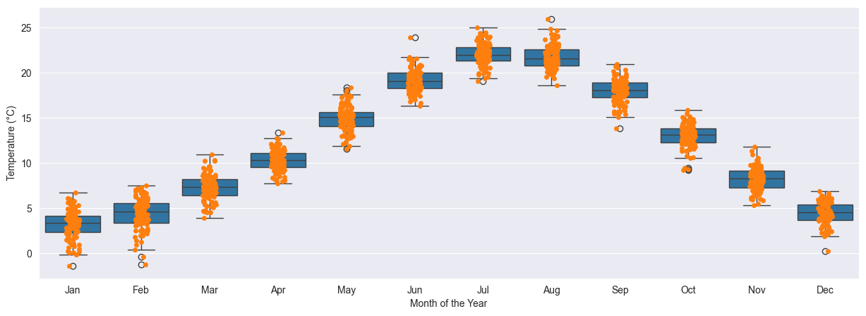
More explicative is a plot over the months. Here we can clearly see the change in temperature from the coldest months in winder, with averages generally around 5°C, to the hottest months, with averages in between 20°C and 25°C. On each month the data is distributed in a 5°C spread.
fig, ax = plt.subplots(figsize=(15, 5))
months = ['Jan', 'Feb', 'Mar', 'Apr', 'May', 'Jun', 'Jul', 'Aug','Sep', 'Oct', 'Nov', 'Dec']
sns.boxplot(data=df, x='month', y='y', order=months, ax=ax)
sns.stripplot(data=df, x='month', y='y', ax=ax)
ax.set_xlabel('Month of the Year')
ax.set_ylabel('Temperature (°C)');
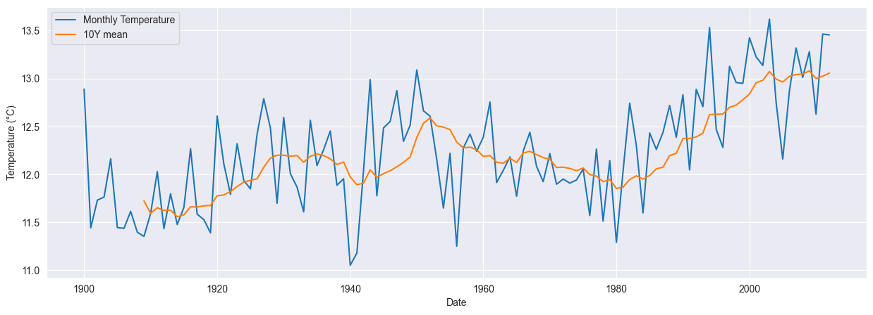
To identify a possible trend we use moving averaged over ten years. This suggests an increase in the monthly temperatures of about 2°C over the last one hundred years.
year_avg = pd.pivot_table(df, values='y', index='year', aggfunc='mean')
year_avg['y_ma_10y'] = year_avg['y'].rolling(10).mean()
year_avg = year_avg.reset_index()
fig, ax = plt.subplots(figsize=(15, 5))
sns.lineplot(data=df, x='year', y='y', label='Monthly Temperature', ax=ax, ci=None)
sns.lineplot(data=year_avg, x='year', y='y_ma_10y', label='10Y mean', ax=ax, ci=None)
plt.xlabel('Date')
plt.ylabel('Temperature (°C)')
plt.legend();
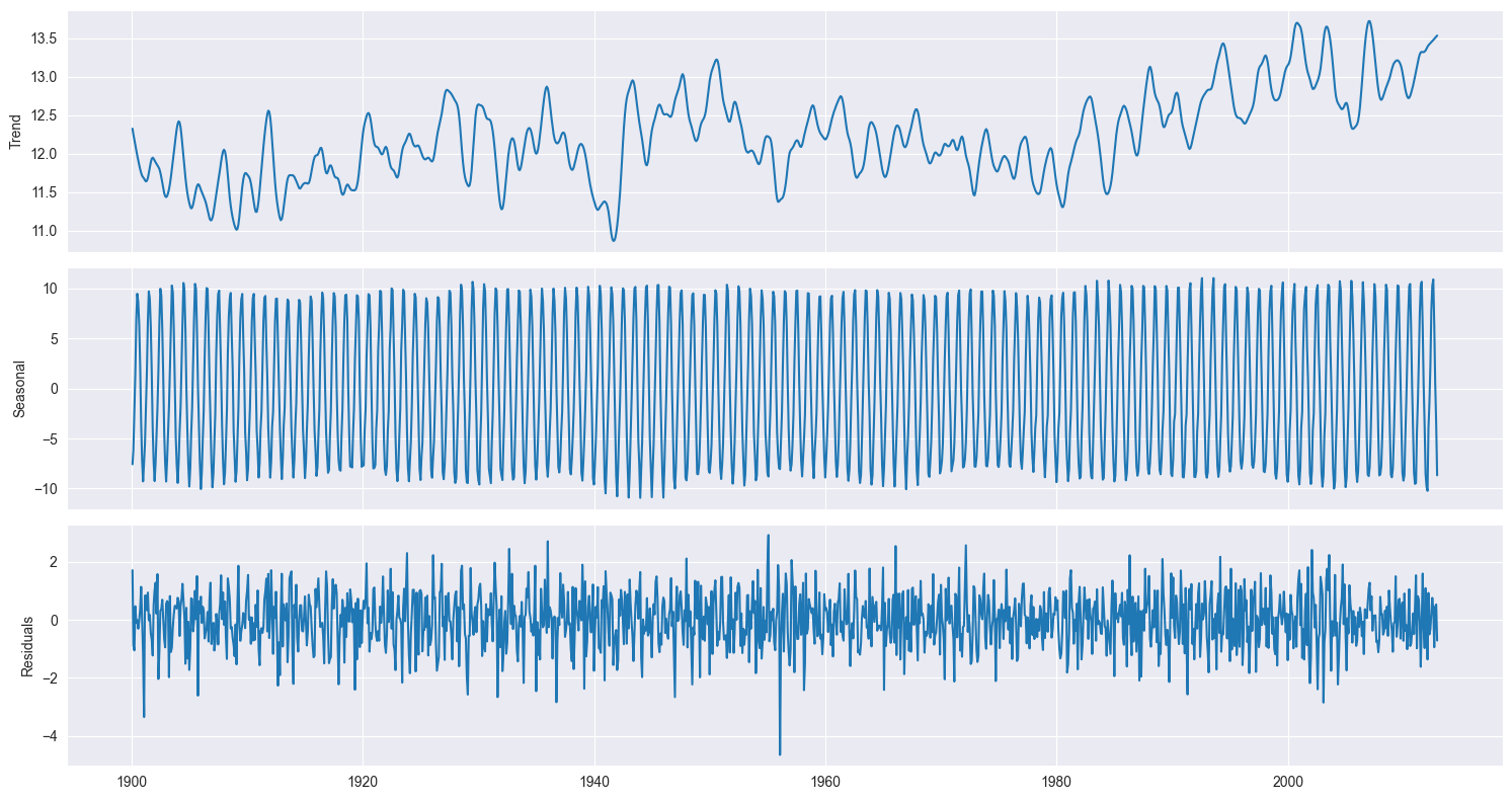
To understand a time series like the one we consider here it is customary to decompose it into its components: a trend, a seasonal component, and what is left, the residuals. This is called the STL decomposition and we will take the implementation provided by the statsmodels package, which allows us to visualize the components to help us identify the trend and seasonal patterns that are not always straightforward just by looking at the original dataset.
from statsmodels.tsa.seasonal import seasonal_decompose, STL
decomposition = STL(df.y, period=12).fit()

fig, (ax0, ax1, ax2) = plt.subplots(figsize=(15, 8), nrows=3, ncols=1, sharex=True)
ax0.plot(decomposition.trend)
ax0.set_ylabel('Trend')
ax1.plot(decomposition.seasonal)
ax1.set_ylabel('Seasonal')
ax2.plot(decomposition.resid)
ax2.set_ylabel('Residuals')
fig.tight_layout()
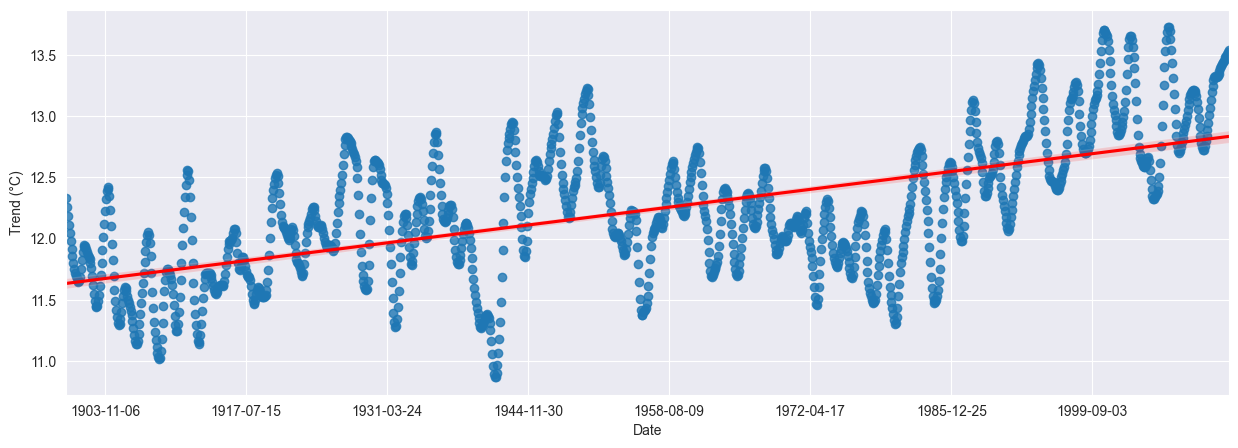
Is the trend showing a clear direction? To assess this, we fit a linear regression model with orders one, two and three. Results are quite similar, with a small plateau in the years 1950 to 1980. Using an order of one shows an increase of about 1°C over the last one hundred years. Plotting a regression model over dates isn’t as simple as it should be in seaborn.
import statsmodels.api as sm
trend = decomposition.trend.dropna().reset_index()
trend['date_ordinal'] = trend.date.apply(lambda date: date.toordinal())

fig, ax = plt.subplots(figsize=(15, 5))
sns.regplot(
    data=trend,
    x='date_ordinal',
    y='trend',
    ax=ax,
    line_kws=dict(color='red'),
    order=1,
    # lowess=True,
)
ax.set_xlim(trend.date_ordinal.min() - 1, trend.date_ordinal.max() + 1)
ax.set_xlabel('Date')
ax.set_ylabel('Trend (°C)')
from datetime import date
new_labels = [date.fromordinal(int(item)) for item in ax.get_xticks()]
ax.set_xticklabels(new_labels);
A stationary time series has statistical properties that do not change over time — mean, variance, autocorrelation are all independent of time. Many forecasting models assume stationary, so it is an important property to check. Moving averages, autoregressive models and their combinations assume stationarity and can be reliably used only if the series is so. Intuitively this is because we would need further parameters to capture the changes over time, so the series isn’t stationary we can’t forecast future values.
Clearly, few series of interest are stationary in their raw form. The STL decomposition above helps us to remove seasonality and trend; we are left with the residuals, for which we need the stationarity. Several methods exist to make a series stationary; here we focus on of the simplest: differencing. Differencing is a transformation that calculates the change from one timestep to another and is very useful to stabilize the mean. We can differenciate between consecutive ones or with a seasonal lag. Since the seasonality (also in literal sense) is quite strong, we will check both one-month and twelve-month differencing. It turns out that first-order differencing is enough; other situations may require second-order differencing or fractional differences.
Implicit in our previous discussion is the assumption that we can check for stationary. This isn’t quite simple but a few tests have been developed over the years. We will use the augmented Dickey-Fuller test, which tests for the presence of a unit root. If a unit root is present, the time series is not stationary. In this test, the null hypothesis states that a unit root is present, meaning that our time series is not stationary. If the test returns a p-value that is less than a certain significant level, typically 0.05 or 0.01, then we can reject the null hypothesis. This means that there are no unit roots and the series is stationary.
y = df.y.dropna()
from statsmodels.tsa.stattools import adfuller
res = adfuller(y)
print(f'Observed data: ADF statistics: {res[0]}, p-value: {res[1]}')
res = adfuller(np.diff(y, n=1))
print(f'First-order differenced data: ADF statistics: {res[0]}, p-value: {res[1]}')
res = adfuller(np.diff(y, n=12))
print(f'First-order differenced data: ADF statistics: {res[0]}, p-value: {res[1]}')
Observed data: ADF statistics: -3.4263718902503433, p-value: 0.010092042879276453
First-order differenced data: ADF statistics: -16.35212390756837, p-value: 2.925519649193536e-29
First-order differenced data: ADF statistics: -25.706176135107768, p-value: 0.0
We will use a seasonal autoregressive integrated moving average, or SARIMA model, which is suitable for this kind of time series. From the results above we the time series is stationary already, so we’ll keep it like this for consecutive entries. From the ACF and PACF plots we did at the beginning, instead, we need differencing for the seasonal behavior, even if we don’t know of which order. Intuitively a frequency of 12 makes sense, where by frequency we mean the number of observations per seasonal cycle.
The SARIMA model has several parameters: the order of the autoregressive process $p$, the order of differentiation $d$, the lag $q$ of the moving average process, and the $P$, $D$ and $Q$ seasonal counterparts, given that we can reasonably assume a frequency of 12 (months). To find the optimal parameters we can proceed in two ways: either by visual exploration or by calibrating several combinations and choosing the one that has the best indicator. The indicator we will use is the Akaike information criterion, or AIC; alternatively one can use the Bayesian information criterion.
Let’s start from the first method. We repeat the plots done above for the ACF and PACF after a first-order seasonal differencing of 12 and see what we get.
y = df.y.diff(12).dropna()
fig, (ax0, ax1) = plt.subplots(nrows=2, figsize=(10, 5))
plot_acf(y, lags=48, zero=True, ax=ax0);
ax1.set_xlabel('Lag')
ax1.set_ylabel('Correlation')
plot_pacf(y, lags=48, zero=True, ax=ax1);
ax2.set_xlabel('Lag')
ax2.set_ylabel('Correlation')
fig.tight_layout()
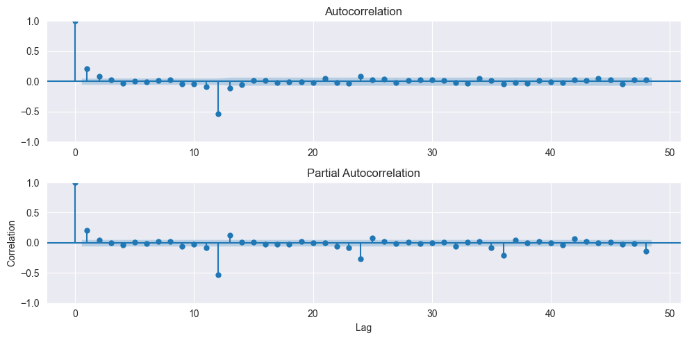
From the ACF plot we can assume $q=2$, while the PACF drops under the confidence interval after the first lag, suggesting $p=1$. Both the ACF and PACF also show significant entries with a lag of twelve, suggessting $P=1$ and $Q=1$. Therefore a good candidate would be a SARIMA model with $(p, d, q), (P, D, Q)$ of $(1, 0, 2), (1, 1, 1)$ and a seasonality of 12.
The second approach is to fit several models and choose the one with the best AIC. We will use all the possible combinations of the values of $p, q, P$ and $Q$ in ${0, 1, 2, 3}$. The model is fitted using the training dataset, while the test dataset, composed of the last ten years, is left aside for the final assessments. We can assume that the trend is linear from our previous discussion. This step is quite time consuming, lasting well above 30 minutes.
from tqdm import tqdm
from statsmodels.tsa.statespace.sarimax import SARIMAX
warnings.filterwarnings("ignore", message="Maximum Likelihood optimization failed to converge")
def optimize_SARIMAX(endog, exog, orders, d, D, s, trend):
    import warnings
    results = []
    for order in tqdm(orders):
        try:
            with warnings.catch_warnings():
                warnings.filterwarnings("ignore")
                model = SARIMAX(
                    endog,
                    exog,
                    order=(order[0], d, order[1]),
                    seasonal_order=(order[2], D, order[3], s),
                    simple_differencing=False,
                    trend=trend,
                ).fit(disp=False)
        except:
            continue

        results.append([*order, model.aic, model.bic])

    results = pd.DataFrame(results)
    results.columns = ['p', 'q', 'P', 'Q', 'AIC', 'BIC']
    results = results.sort_values(by='AIC', ascending=True).reset_index(drop=True)
    return results
df_train = df.y[:-120]
df_test = df.y[-120:]
from itertools import product
orders = list(product(
    range(0, 4),
    range(0, 4),
    range(0, 4),
    range(0, 4),
))
d, D, s = 0, 1, 12
results = optimize_SARIMAX(df_train, None, orders=orders, d=d, D=D, s=s, trend='c')
100%|██████████| 256/256 [1:24:15<00:00, 19.75s/it]
results = results.set_index(['p', 'q', 'P', 'Q'])
The results are ranked in ascending order of the AIC; we select the values corresponding to the one with the best AIC. Those values finalize the model.
results.head()
| AIC | BIC | ||||
|---|---|---|---|---|---|
| p | q | P | Q | ||
| 0 | 2 | 3 | 2 | 4120.571239 | 4166.618787 |
| 2 | 0 | 3 | 2 | 4120.665049 | 4166.712596 |
| 1 | 0 | 3 | 2 | 4121.245069 | 4162.176223 |
| 1 | 3 | 2 | 4121.459183 | 4167.506730 | |
| 3 | 3 | 2 | 4121.585784 | 4177.866120 |
p, q, P, Q = results.index.values[0]
print(f"Selected p={p}, q={q}, P={P}, Q={Q}")
Selected p=0, q=2, P=3, Q=2
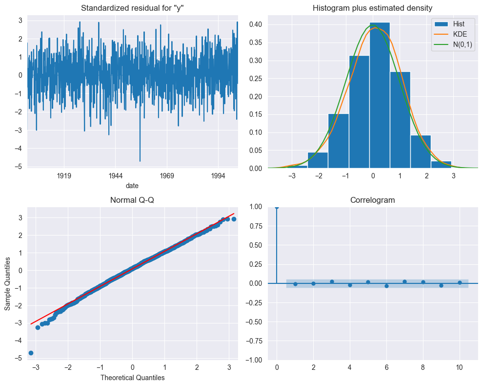
The plot_diagnostic method analyzes the residuals of the fitted SARIMA model. Albeit a bit cluttered, the top left plot shows that the residuals do not exhibit a trend or a change in variance. The top right plot shows that the distribution is very close to the one of a normal distribution. The normality of the residuals is further confirmed by the Q-Q plot at the bottom left, which displays very good agreement with the straight line $y=x$. The correlogram at the bottom right reports no significant coefficients after lag 0. The conclusion is therefore that the residuals of our SARIMA model resemble white noise.
model = SARIMAX(df_train, order=(p, d, q), seasonal_order=(P, D, Q, s), simple_differencing=False)
fitted_model = model.fit(disp=False)
fitted_model.plot_diagnostics(figsize=(10, 8))
plt.tight_layout();
To quantify this observation we can use the Ljung-Box test, a statistical test that determines whether the autocorrelation of a set of data is significantly different from zero. The null hypothesis states that the data is independently distributied, that is there is no autocorrelation. If the p-value is above a given threshold, say 0.05, we cannot reject the null hypothesis and we must assume that the residuals are independently distributed. The test can be performed using the acorr_ljungbox function of the statsmodels package.
residuals = fitted_model.resid
from statsmodels.stats.diagnostic import acorr_ljungbox
acorr_ljungbox(residuals, np.arange(1, 11, 11))
| lb_stat | lb_pvalue | |
|---|---|---|
| 1 | 294.509434 | 5.176273e-66 |
The value is largely above the p-value, therefore our residuals can be thought of being white noise.
To assess the quality of our model we need one or more baselines. A baseline is often the simplest solution we can think of, or one or more simple heuristics that allow us to generate predictions. Baselines often don’t require any training, as for the naïve prediction below, and therefore the cost of implementation is very low. Being simple to implement, it should be void of errors. If our (sophisticated) model behaves in line with the baseline then it is not worth using it – baselines set the bar for what is acceptable and what is not.
Our baselines are the naïve prediction and the seasonal naïve prediction. The first simply takes the value of the last month and the implementation is a one-liner, the latter takes as increment the increment seen twelve months ago and it is only a little bit more complicated. The seasonal naïve prediction is computed in function rolling_forecast; this also computes the SARIMA predictions in a rolling sense, that is by fitting the model up to the selected horizon and predicting the next value.
def rolling_forecast(df: pd.DataFrame, train_len: int, horizon: int, window: int, method: str) -> list:
    from tqdm import trange
    total_len = train_len + horizon
    if method == 'last_season':
        pred_last_season = []
        for i in range(train_len, total_len, window):
            last_season = df['y'][i - window:i].values
            pred_last_season.extend(last_season)
        return pred_last_season

    elif method == 'SARIMA':
        pred_SARIMA = []
        for i in trange(train_len, total_len, window):
            model = SARIMAX(df['y'][:i], order=(2, 1, 3), seasonal_order=(1, 1, 3, 12),
                            simple_differencing=False)
            res = model.fit(disp=False)
            predictions = res.get_prediction(0, i + window - 1)
            oos_pred = predictions.predicted_mean.iloc[-window:]
            pred_SARIMA.extend(oos_pred)
        return pred_SARIMA
TRAIN_LEN = len(df_train)
HORIZON = len(df_test)
WINDOW = 12

last_season = rolling_forecast(df, TRAIN_LEN, HORIZON, WINDOW, 'last_season')
sarima = rolling_forecast(df, TRAIN_LEN, HORIZON, WINDOW, 'SARIMA')
100%|██████████| 10/10 [02:32<00:00, 15.26s/it]
def compute_rmse(y_true, y_pred):
    from sklearn.metrics import mean_squared_error
    return np.sqrt(mean_squared_error(y_true, y_pred))

naive = df_test.shift(1).dropna()

print(f"RMSE:")
print(f'- naïve:       {compute_rmse(df_test.iloc[1:], naive):.4f} (°C)')
print(f'- last season: {compute_rmse(df_test, last_season):.4f} (°C)')
print(f'- SARIMA:      {compute_rmse(df_test, sarima):.4f} (°C)')
RMSE:
- naïve:       3.9803 (°C)
- last season: 1.8120 (°C)
- SARIMA:      1.2857 (°C)
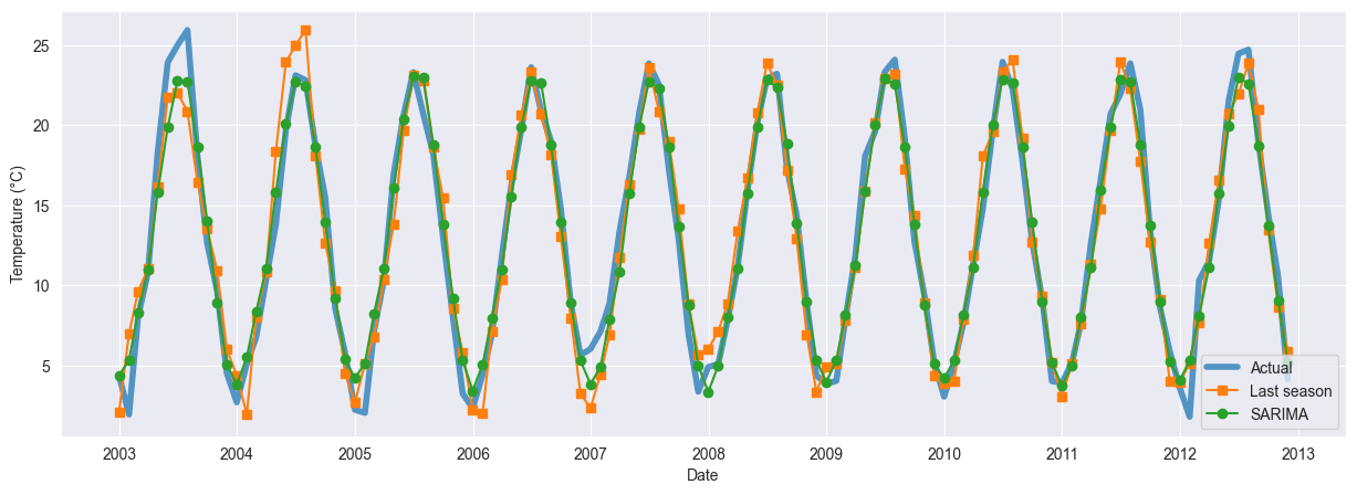
These results show an important improvements for the seasonal naïve forecast, with another significant reduction in the RMSE from the SARIMA model. The additional burden of the SARIMA model is therefore justified. The improvements are confirmed in the MAE.
def compute_mae(y_true, y_pred):
    from sklearn.metrics import mean_absolute_error
    return mean_absolute_error(y_true, y_pred)

naive = df_test.shift(1).dropna()

print(f"MAE:")
print(f'- naïve:       {compute_mae(df_test.iloc[1:], naive):.4f} (°C)')
print(f'- last season: {compute_mae(df_test, last_season):.4f} (°C)')
print(f'- SARIMA:      {compute_mae(df_test, sarima):.4f} (°C)')
MAE:
- naïve:       3.5163 (°C)
- last season: 1.4551 (°C)
- SARIMA:      0.9814 (°C)
fig, ax = plt.subplots(figsize=(15, 5))
plt.plot(df_test.index, df_test.values, label='Actual', linewidth=4, alpha=0.75)
plt.plot(df_test.index, last_season, '-s', label='Last season')
plt.plot(df_test.index, sarima, '-o', label='SARIMA')
plt.xlabel('Date')
plt.ylabel("Temperature (°C)")
plt.legend();
We conclude this post with a couple of references. I found the book Time Series in Python by Marco Peixeiro a good and readable introduction to the subject; most of the procedure reported above is suggested in the book. From the exploratory data analysis of this dataset this Kaggle notebook is worth a look.